


Color Combinations Worth Trying in Fashion & Interiors II
Why do we stick to the same, well-known color palettes?

What color would you wear if you had to choose just one for the rest of your life?
Luckily, we don't have to pick and we are free to try, experiment and play with as many colors as we want. Then, why do we stick to the old, well-known color palettes? There are those who wear all black, those who feel comfortable in nude tones and those who go as far as mixing navy blue and red with stripes à la française. No judging, I love a uniform.
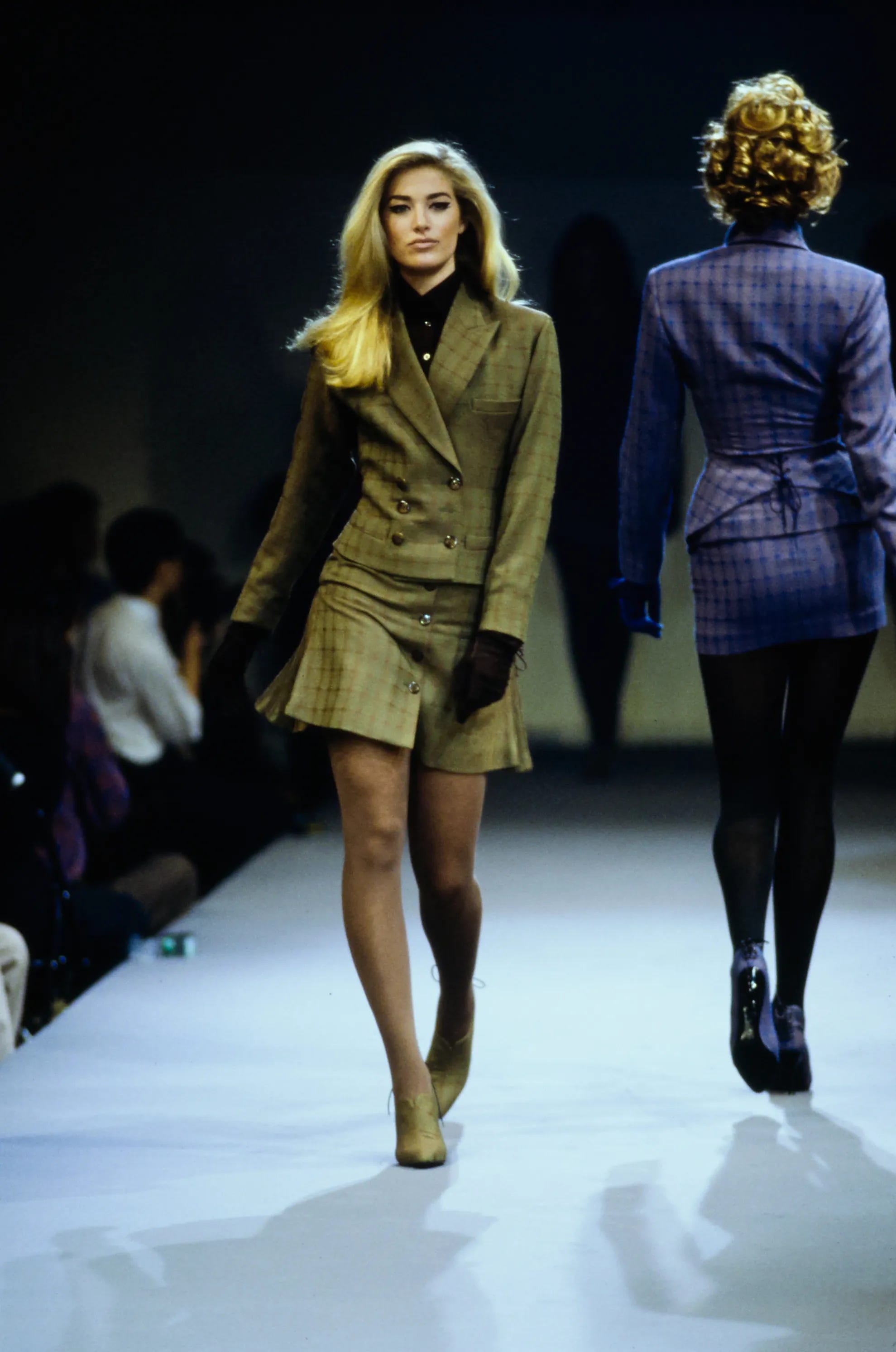
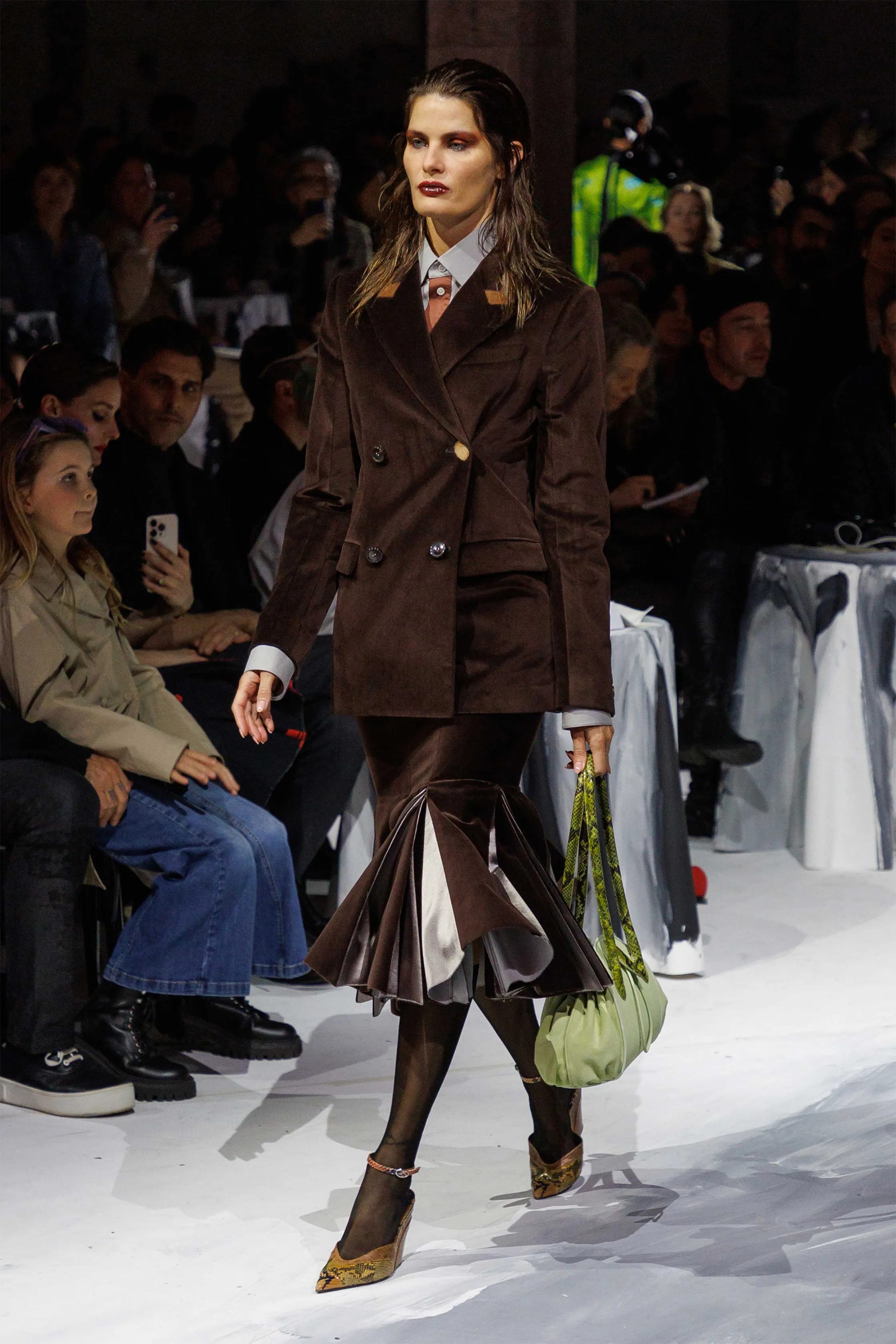
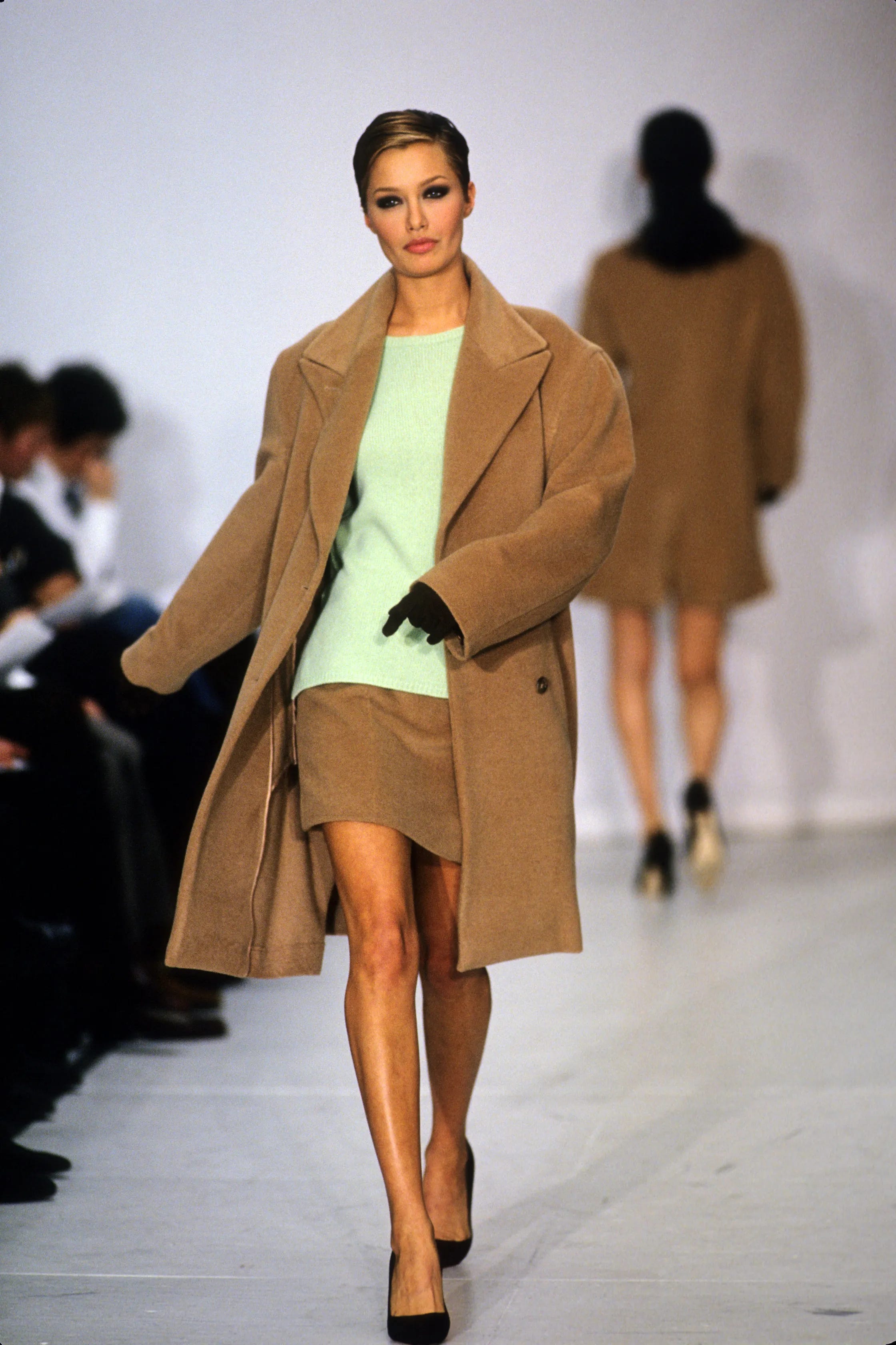
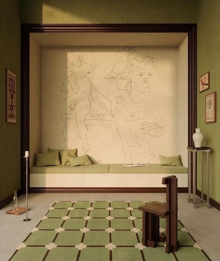
However, The Art of Discovery means exploring outside your comfort zone and getting familiar with the unknown. That’s why, in a new installment of Color Combinations Worth Trying in Fashion and Interiors, I explore three more color combinations. These are inspired by the most recent Fall/Winter 2025 collections and paired with archive collections from 1988-1995 (Prada, Miu Miu, Alaïa, Comme des Garçons, Versace, etc.) and interior design inspiration.
Let me know which one is your favorite in the comments. I dare you to try one of these color combinations this week. Because why not?
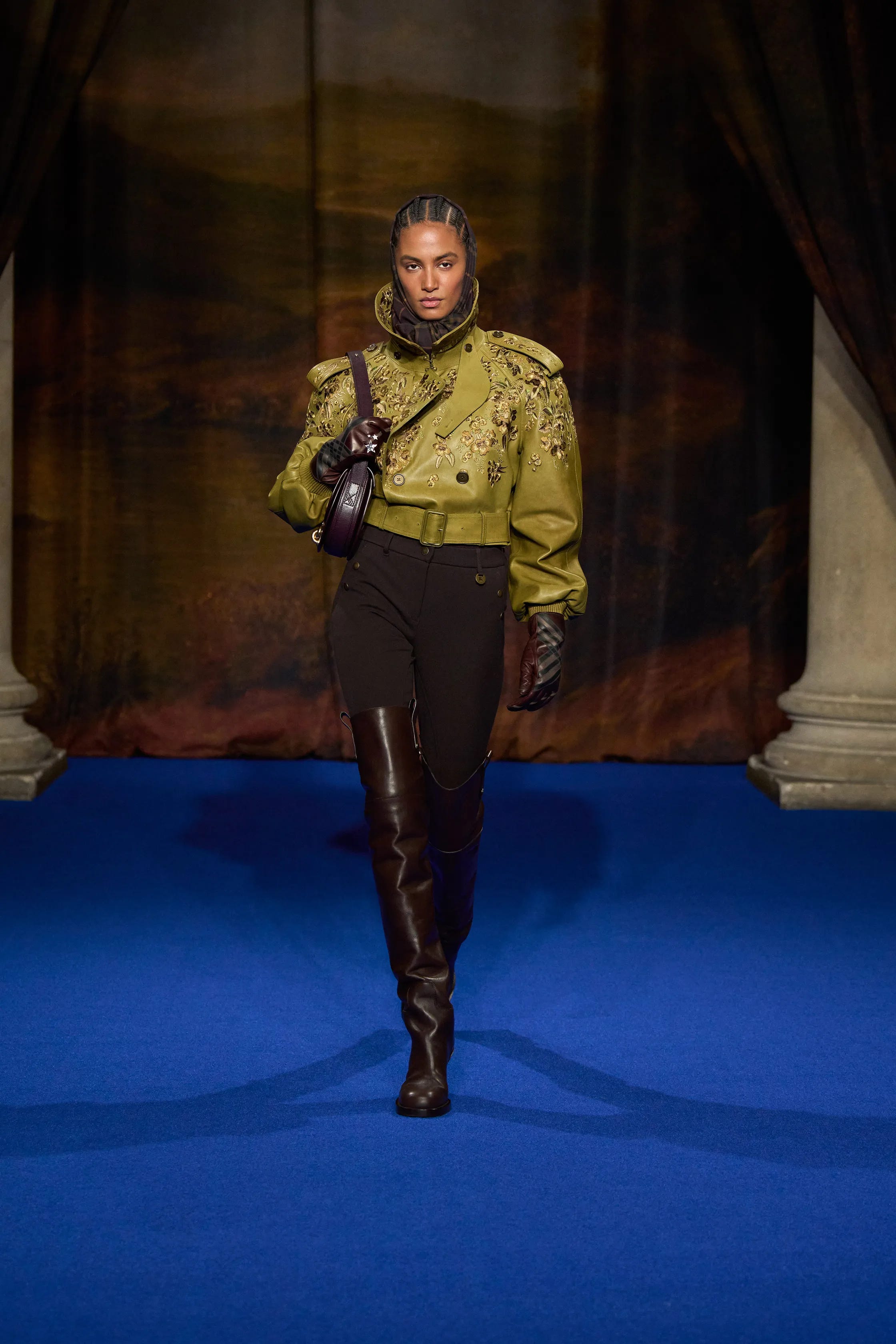
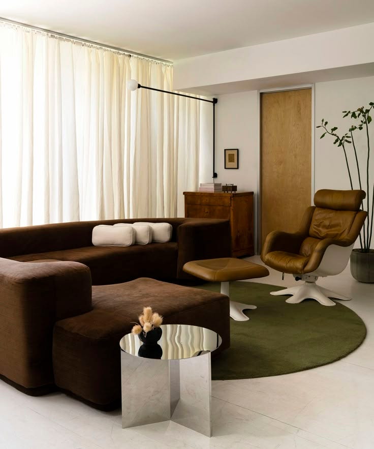
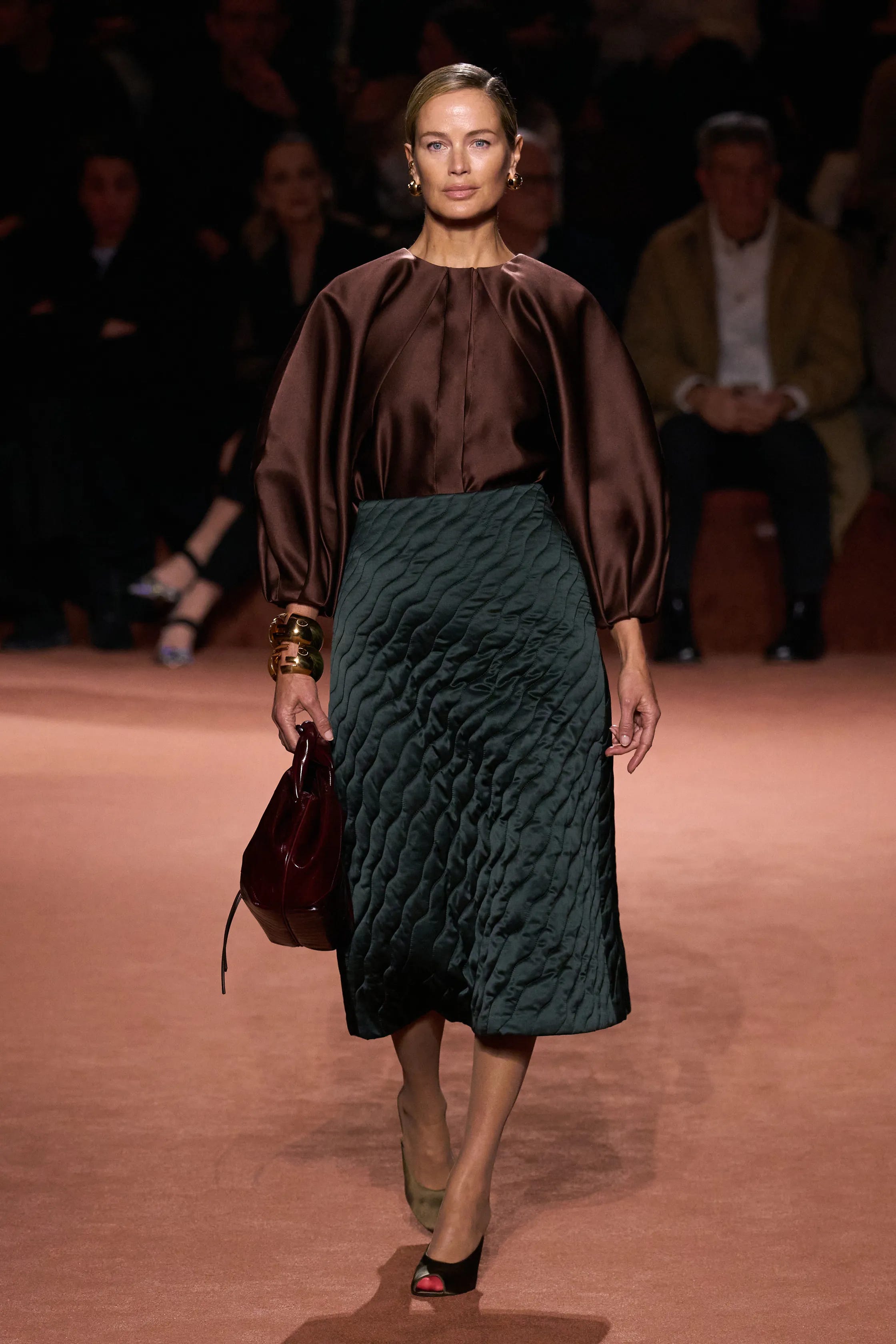
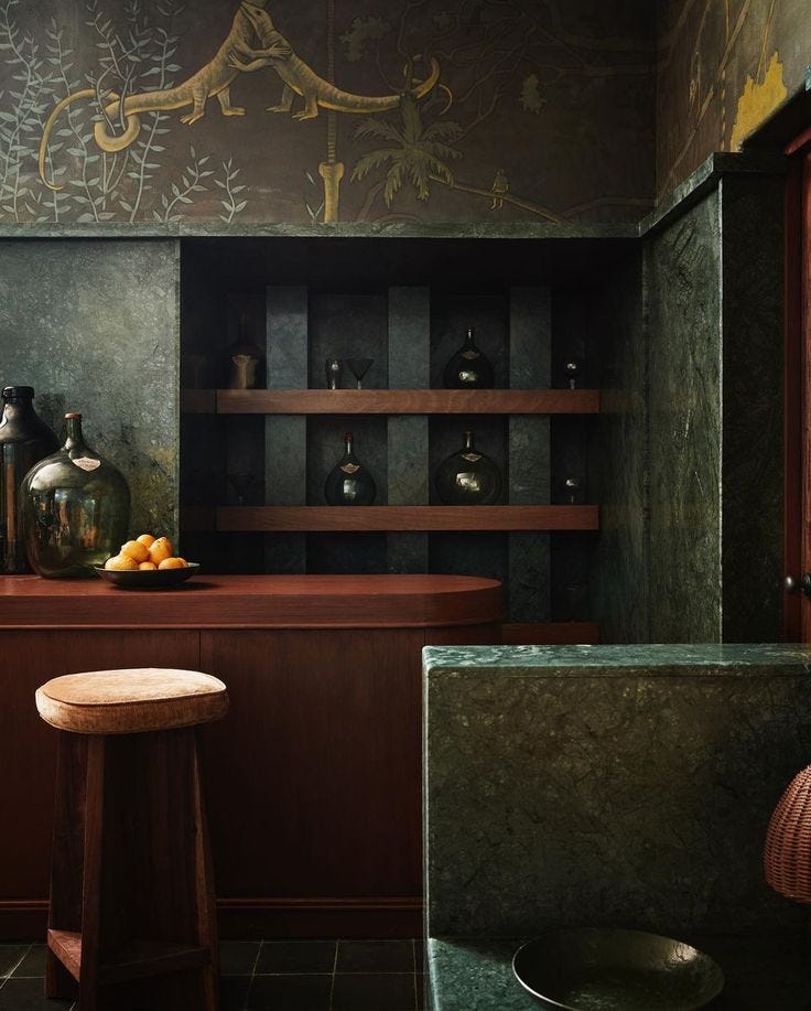
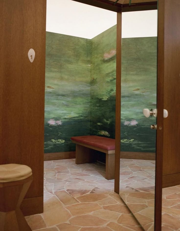
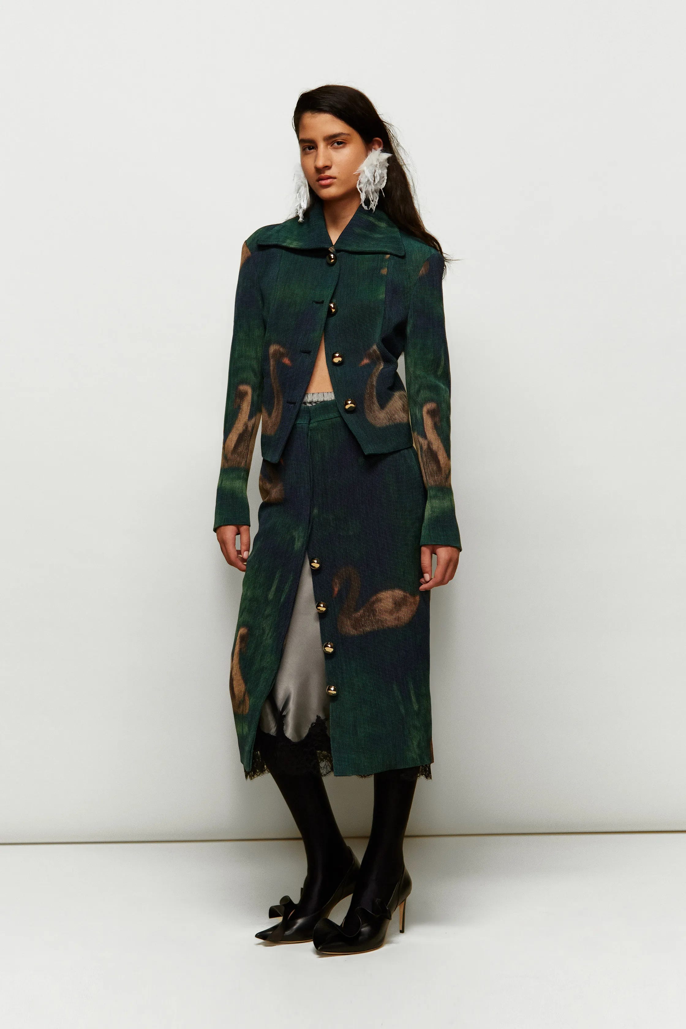
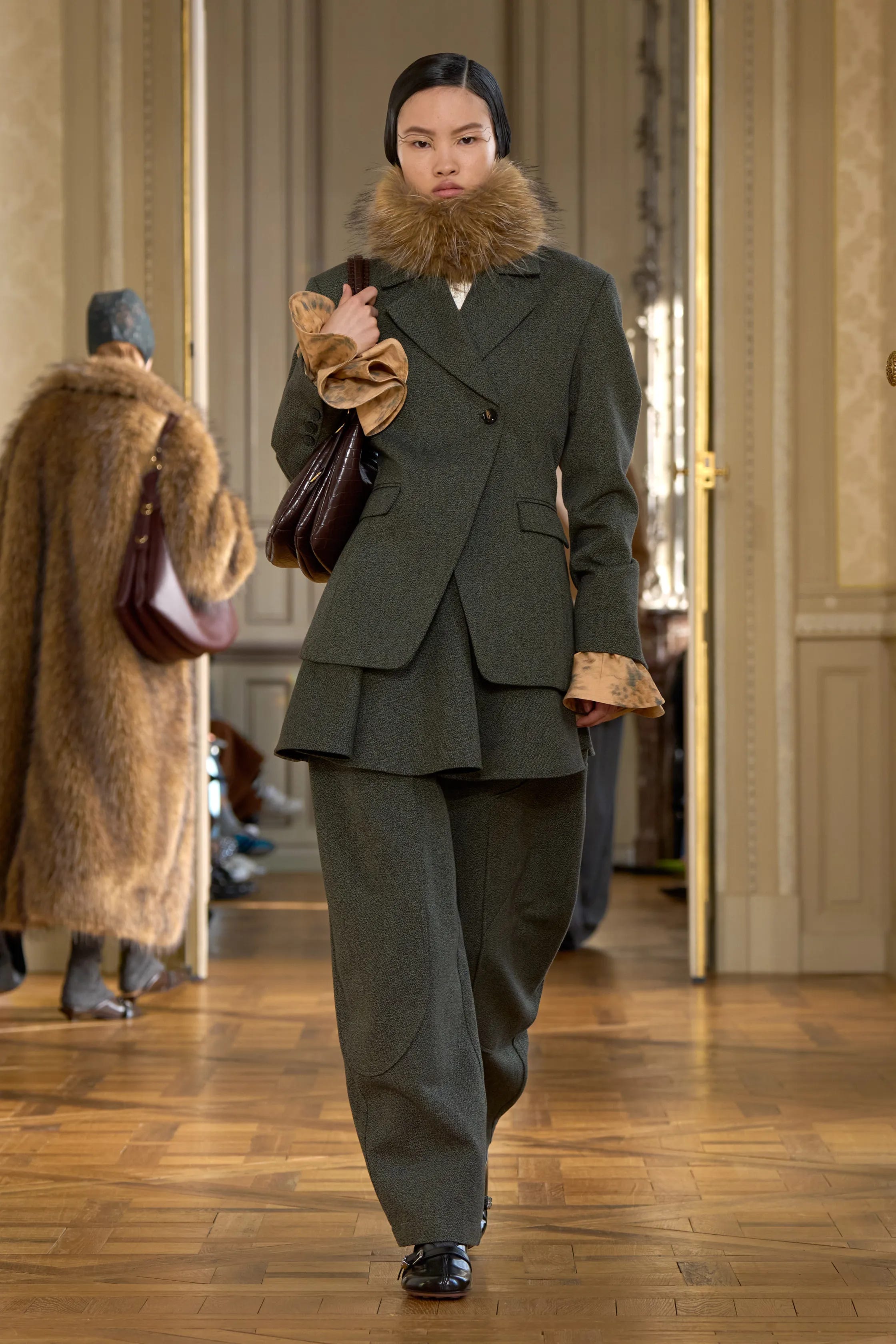
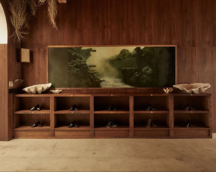
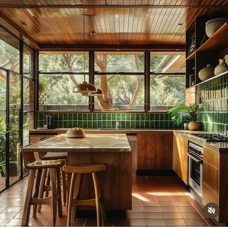
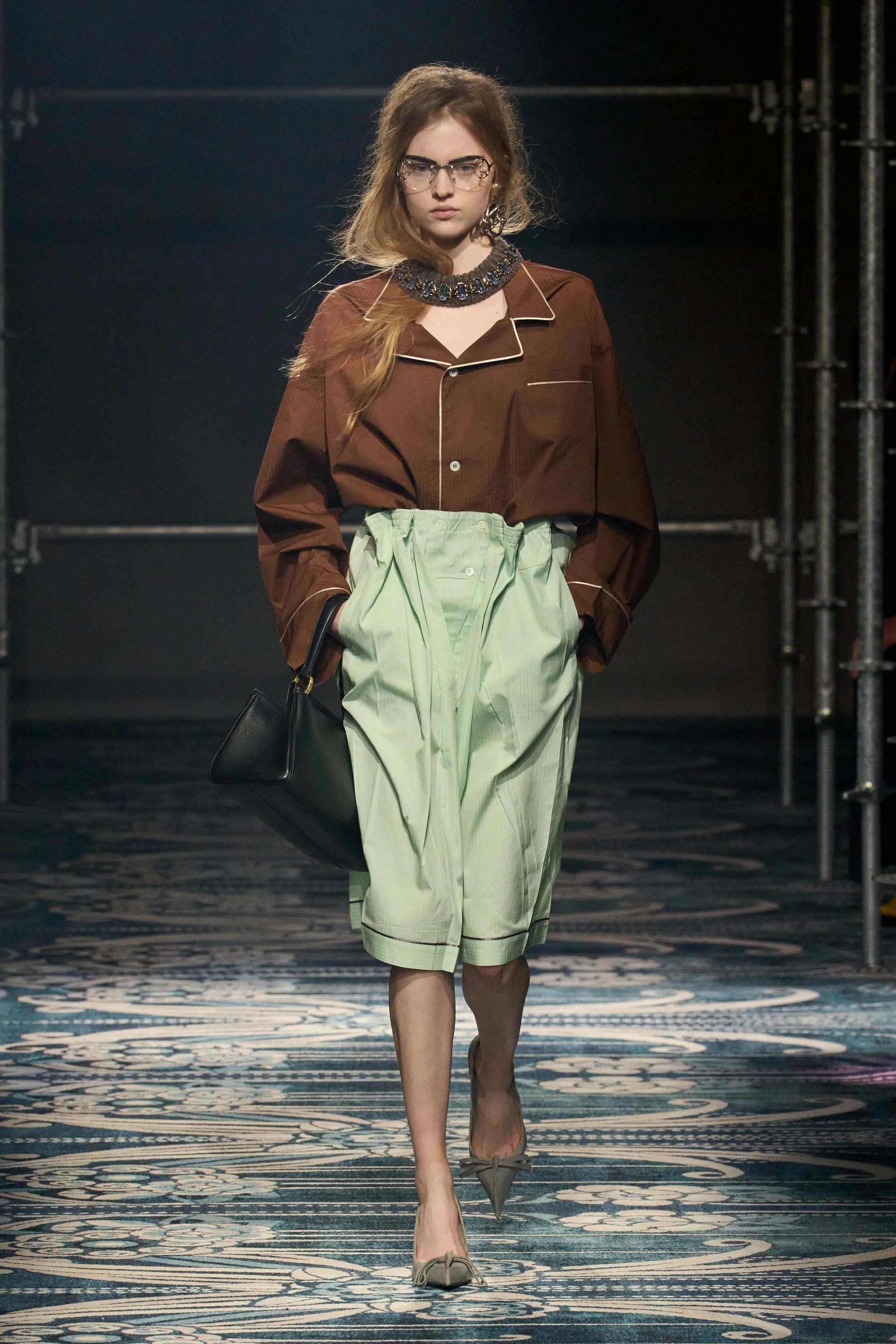
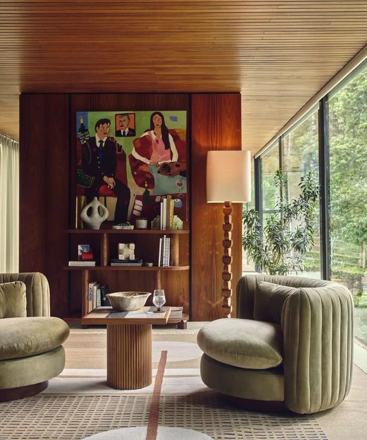
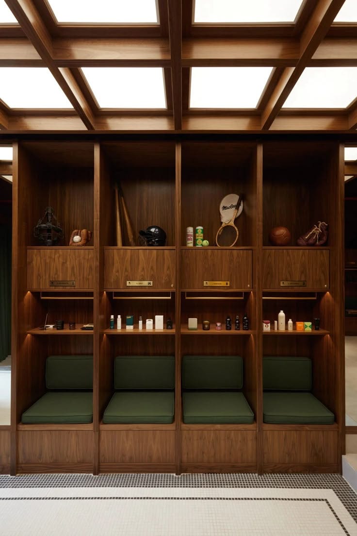
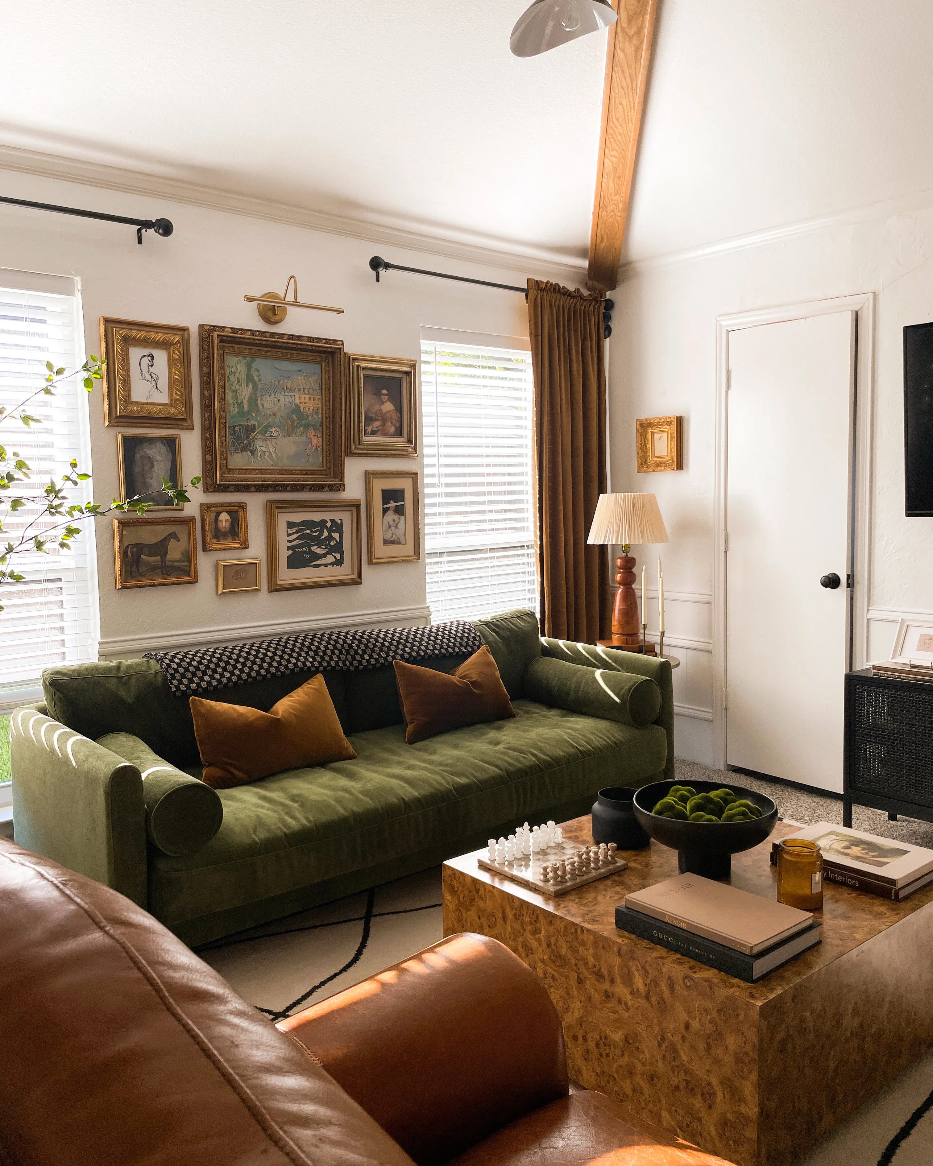
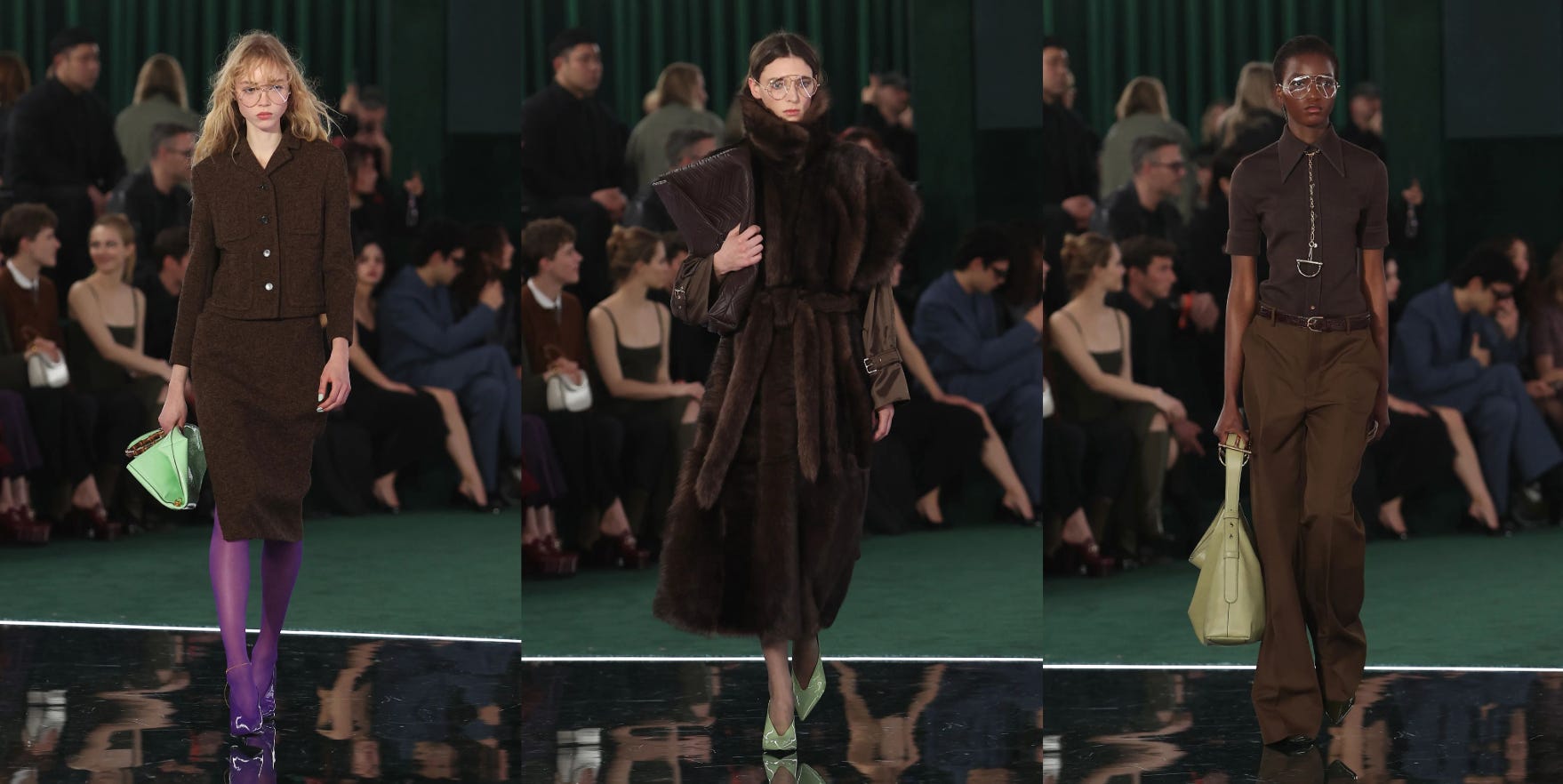
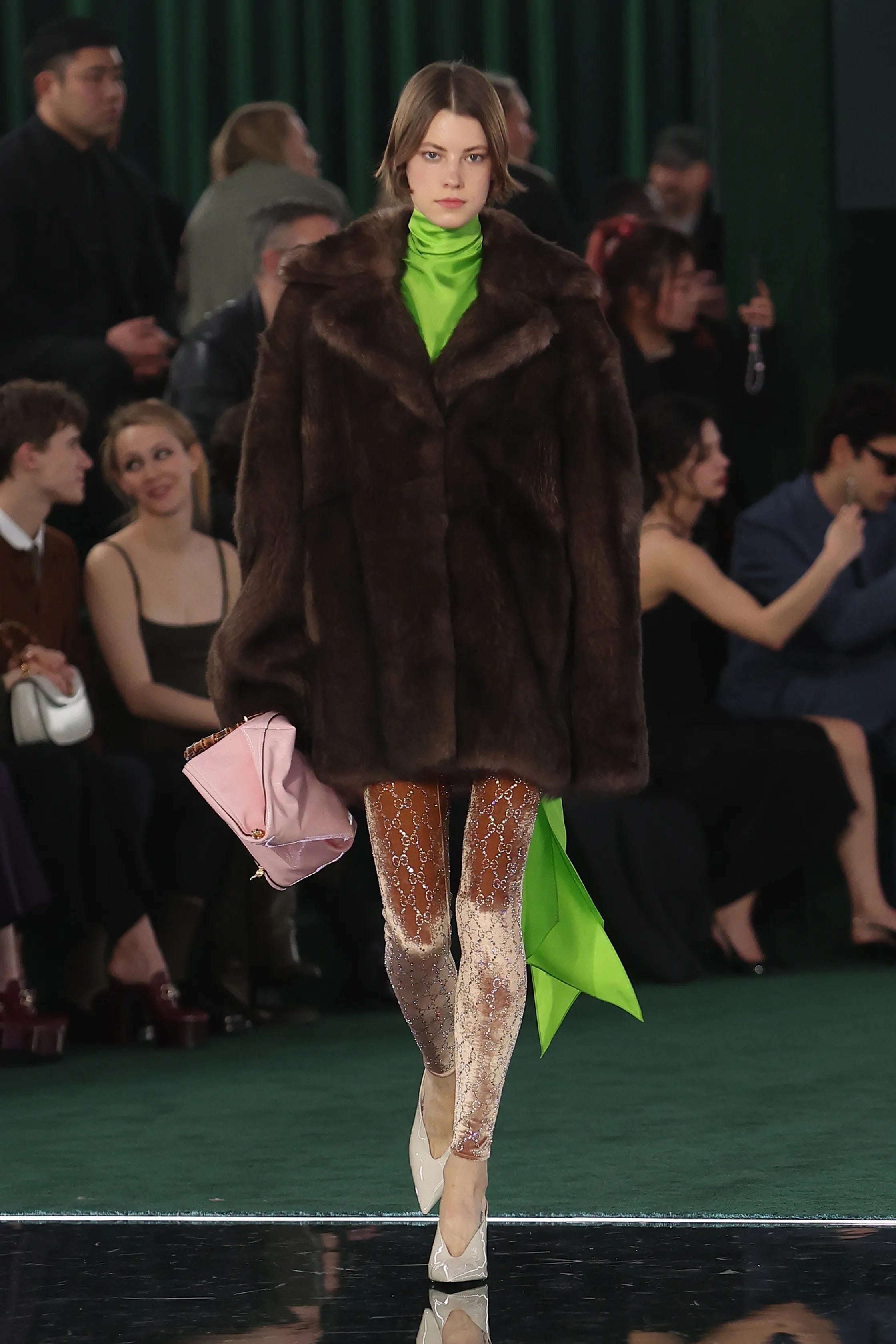
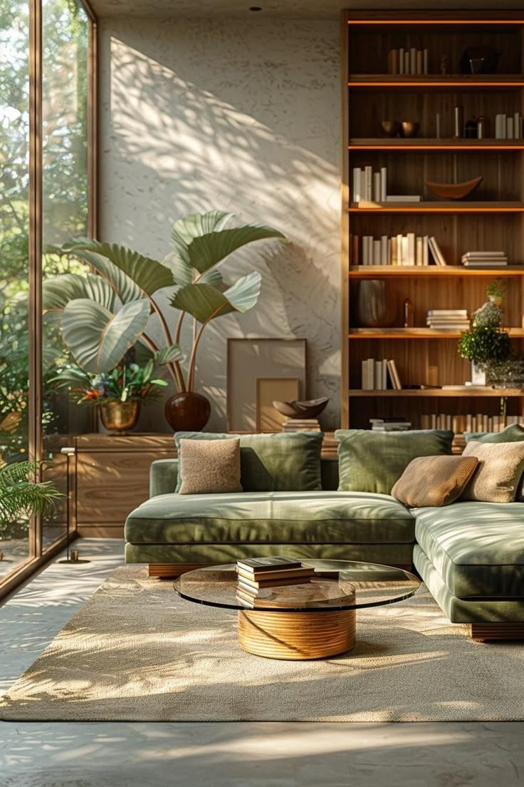
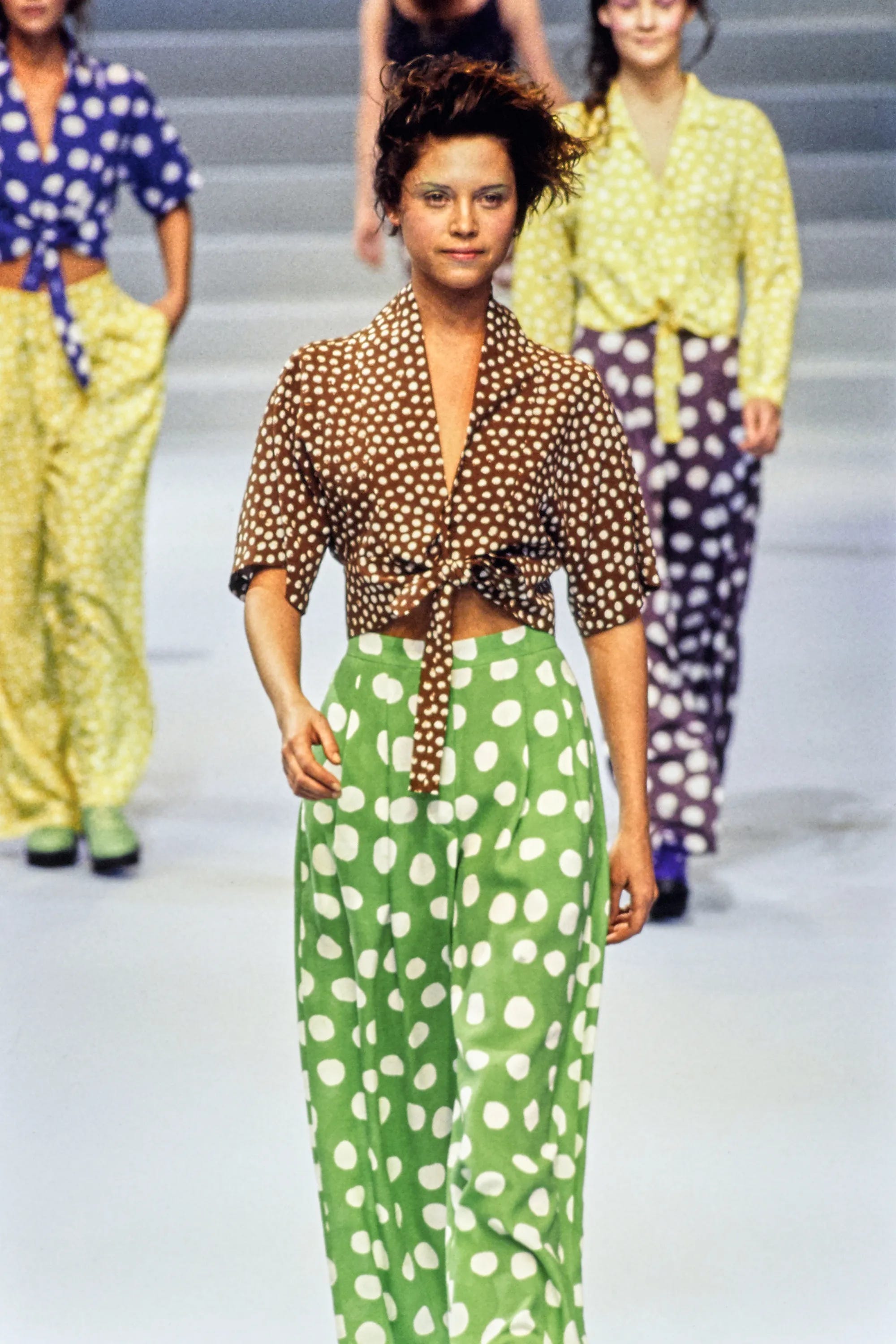
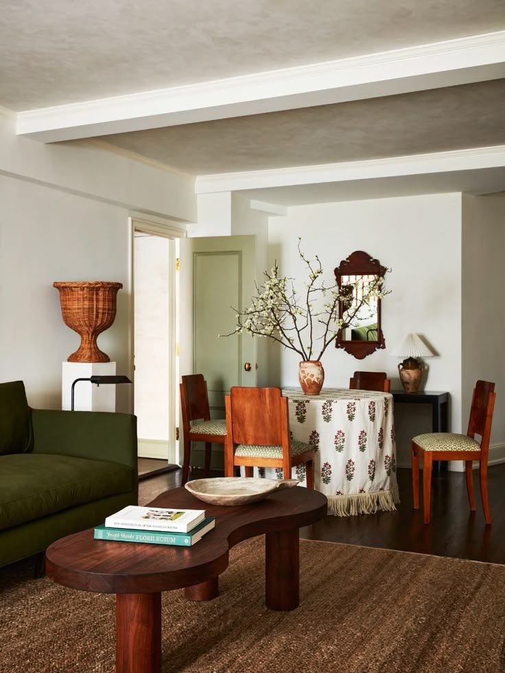
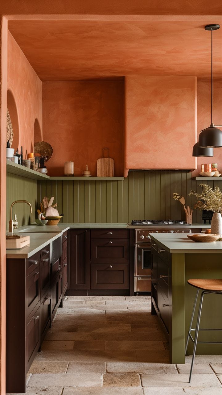
Brown / Green
Brown, as an earthy, grounding color, known for its warm, comforting properties, symbolizes stability, while green brings in a natural freshness. Together, they convey a sense of balance, peace and, rootedness, ideal for creating a restorative environment that evokes a connection to nature.

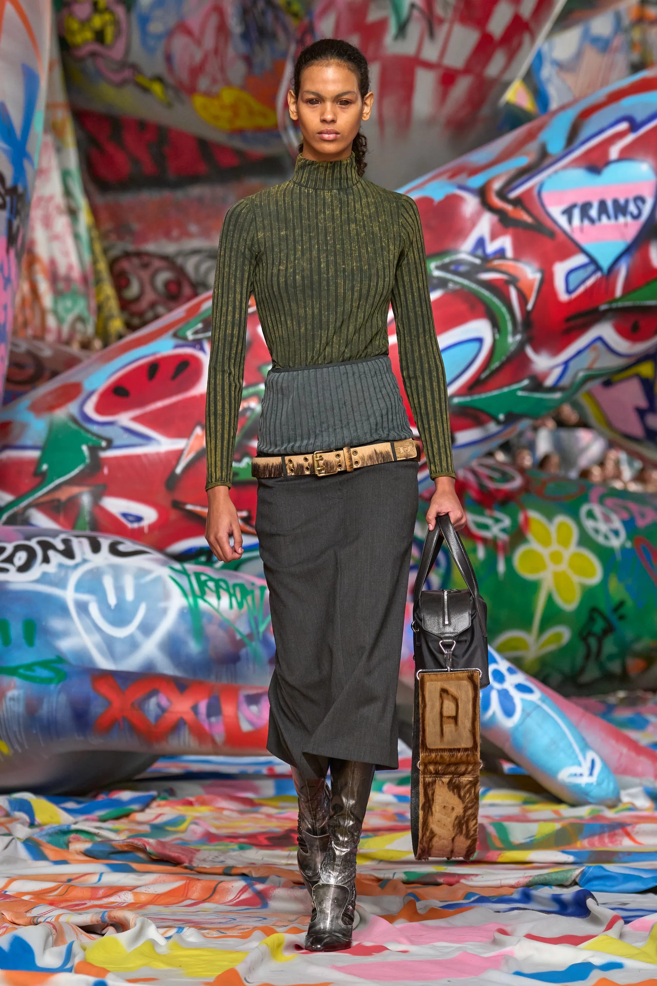


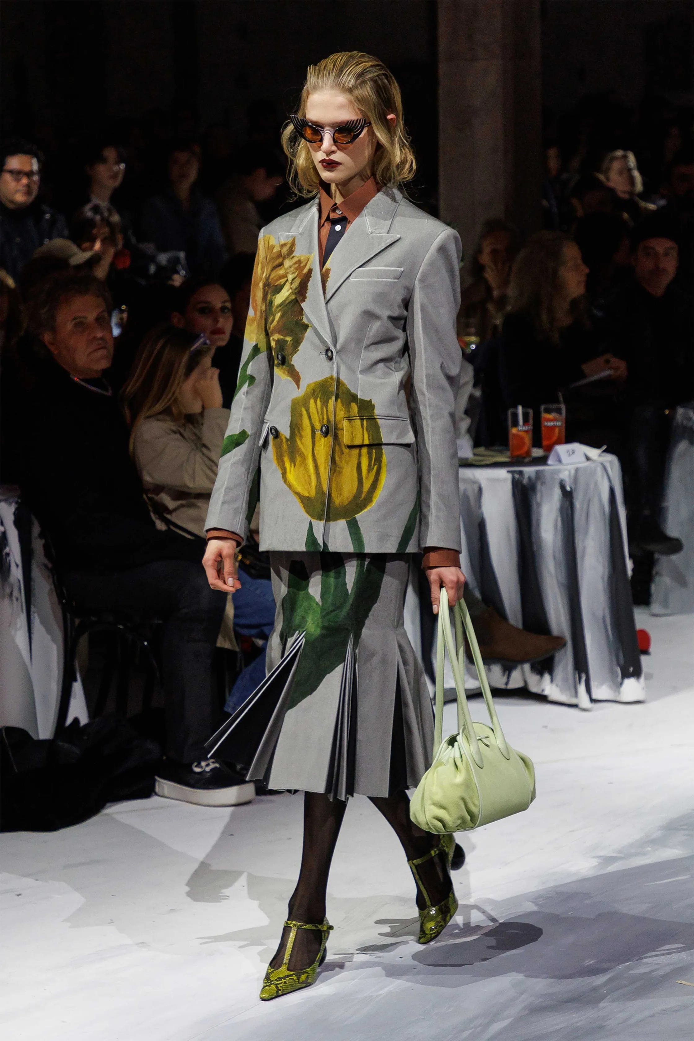


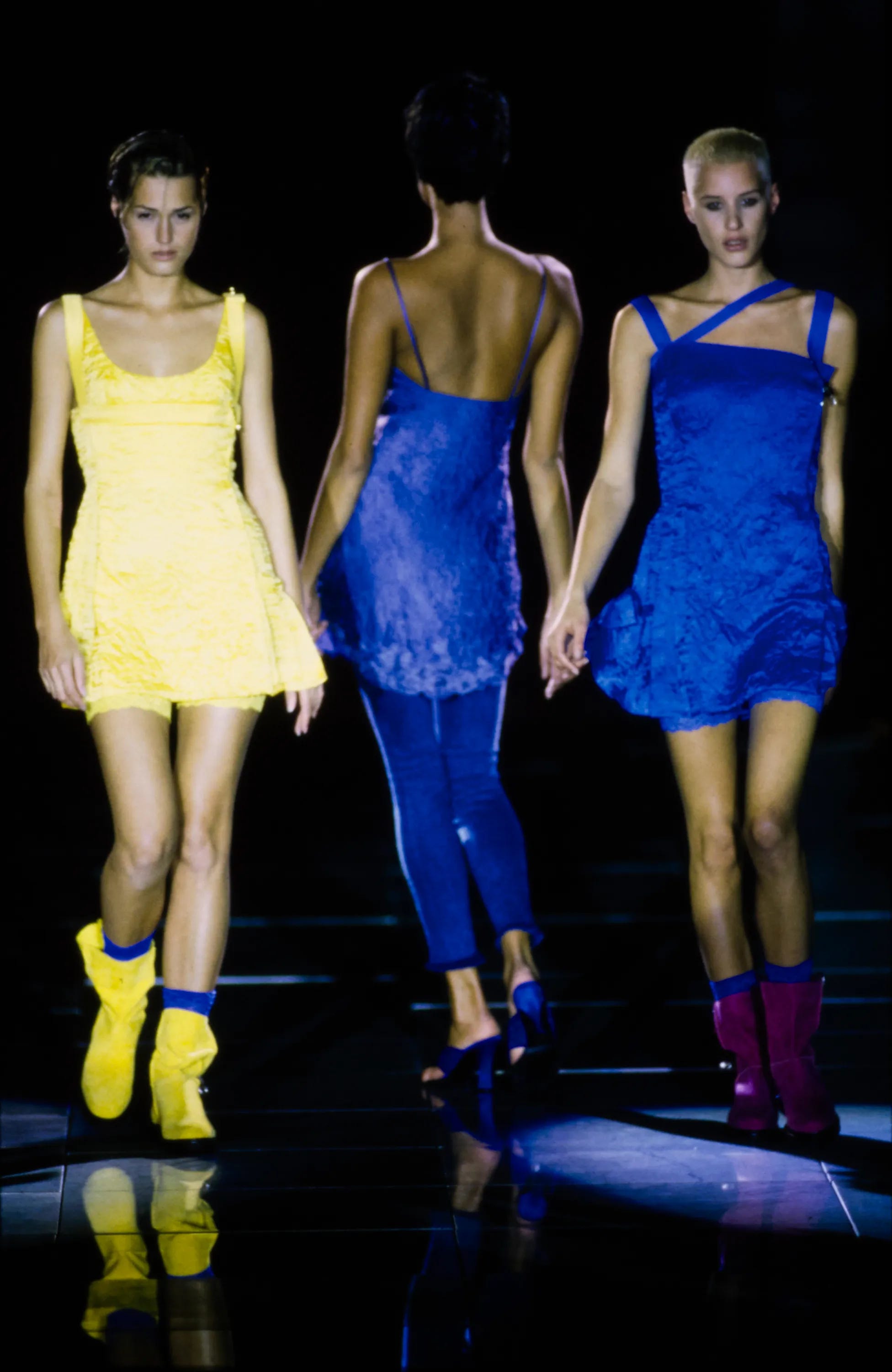
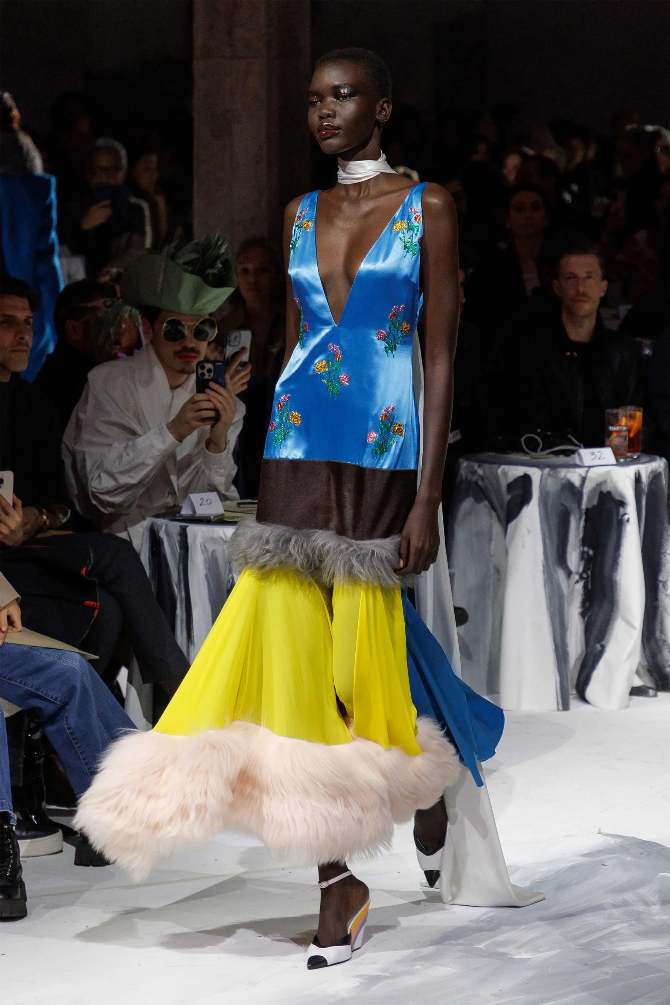
Yellow / Blue
Yellow, with its stimulating qualities -often associated with energy and joy-, paired with blue’s thoughtful, reflective nature, can symbolize clarity of thought and mental sharpness. As complementary colors, when used together, they balance each other.
Keep reading with a 7-day free trial
Subscribe to The Art of Discovery to keep reading this post and get 7 days of free access to the full post archives.