


Color Combinations Worth Trying, In Fashion and Interiors
Inspired by Prada's archive collections. And this is just one idea to hack the trend cycle.

I have been reflecting on a topic for some time now: personal style.
We live in the age of information overload and hyperconnectivity, where we receive external inputs 24/7 to the rhythm of your finger scrolling through TikTok (welcome back) or Instagram, and constant notifications. This frenetic pace leaves us no room for pause, for contemplation—we don't have time to digest the information we receive and generate a critical and authentic opinion about things. “I'm so busy.” We have so many things to do. If you stop, you've already missed out on so much.
The trend cycle continues to accelerate. Micro trends come and go on social media, with shorter and shorter times for the general population to even adapt or get tired of them. Those who follow these trends are left with a closet full of novelties, yet never feeling satisfied with the clothes they have. Sound familiar?
As for macro trends, and due to globalization, we are left with people all over the world (at different times) wearing more or less the same Tabi shoes, then Adidas Samba or Alaïa-inspired ballerinas, now Salomon or Onitsuka Tiger or the boat shoe-loafer hybrid, and maybe Nike Cortez again soon (?). And that's just with footwear.... (Disclosure: From an economic and business standpoint, I get it, and my job is also responsible for it).
On a personal level, I echo the voices defining this feeling of exhaustion and how, hopefully, it translates into a quest for personal style. As José Criales-Unzueta said following the results of Vogue Runway's annual Industry Survey, “many in fashion are feeling burnt out on what’s in.”
Of course, it's hard to escape outside influences (and influencers). The prevailing silhouettes in fashion, like the prevailing styles in architecture and interior design, speak to our Zeitgeist. But let's not lose ourselves in the process.
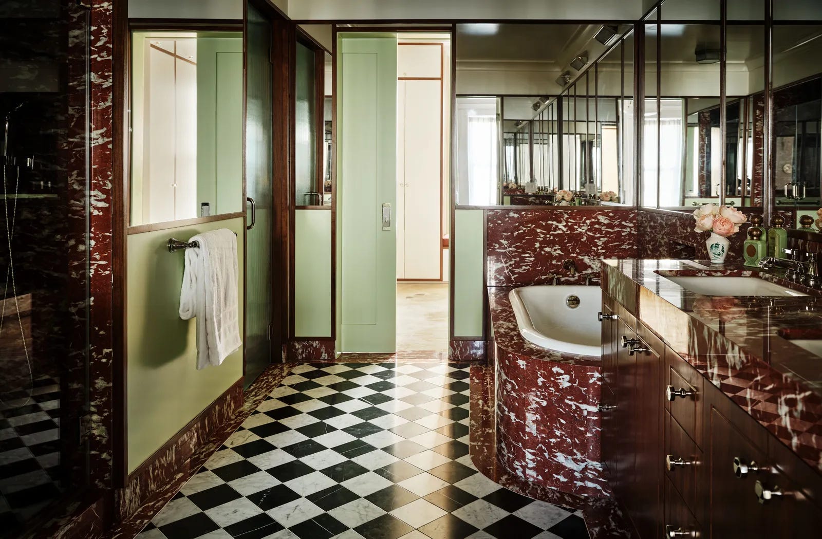
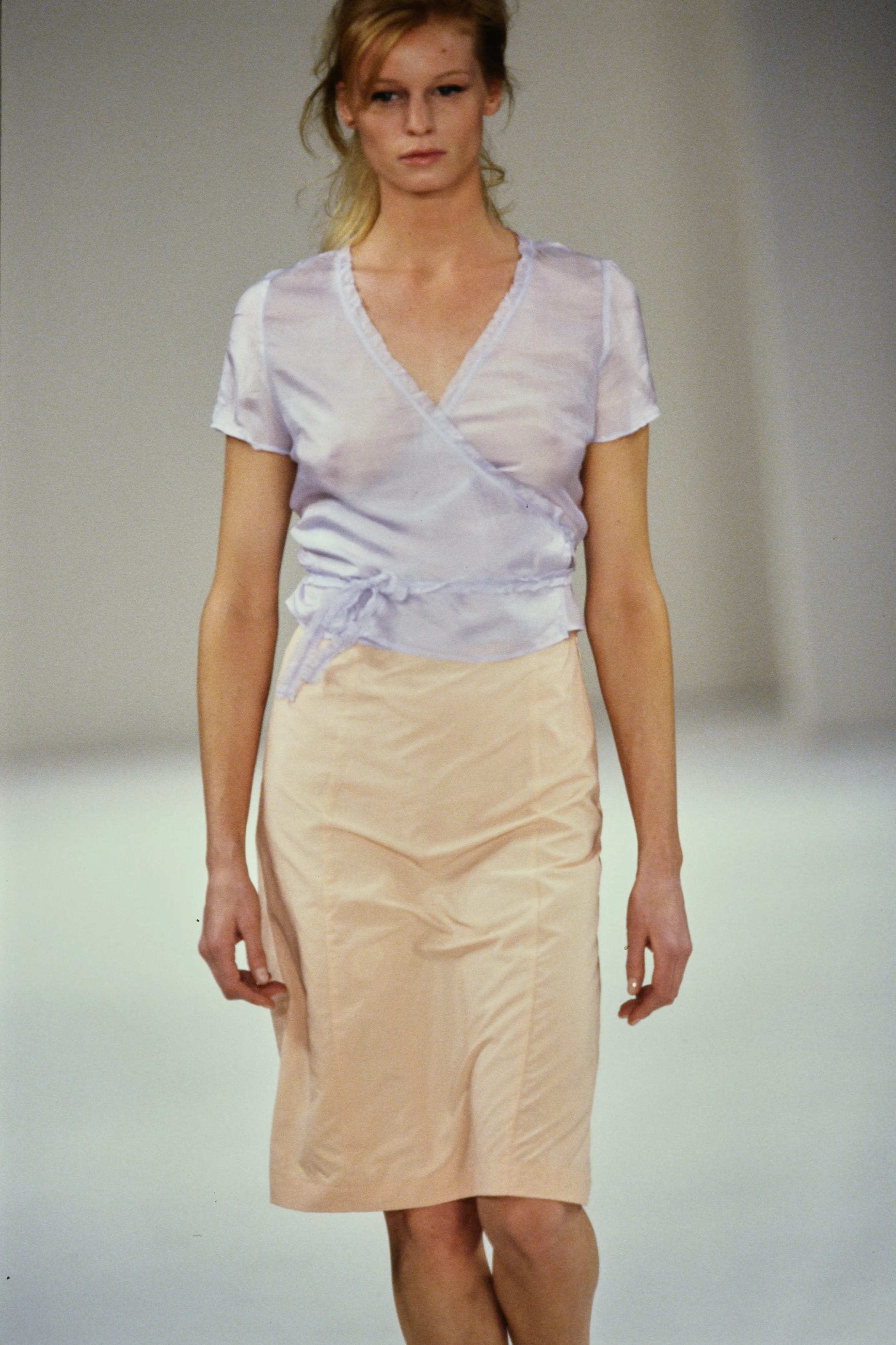
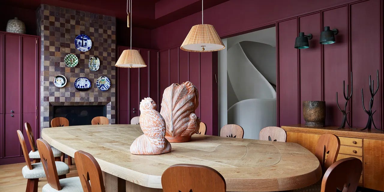
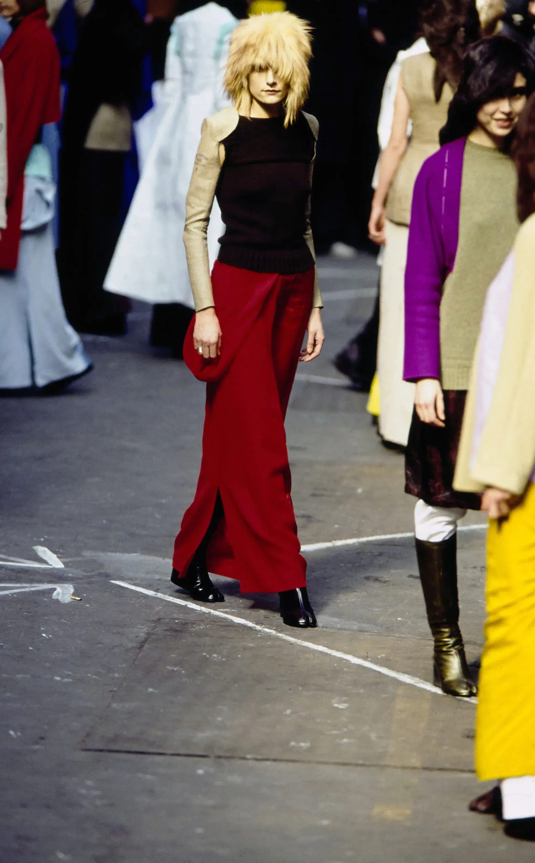
In this new installment of The Art of Discovery, I explore less common color combinations by looking at Prada's archive collections, along with other designers' offerings from 1989 to 2017, and interior design references. I thought it might be fun to explore monthly in the newsletter different ways to experiment with your taste—creating self-challenges to implement small changes and see how you feel about them, even if on a small scale, both in your daily looks and in your spaces.
I like the following quote from Alain de Botton that I underlined from his book “The Architecture of Happiness”. More on this soon!
We should be free to imagine how much tastes could evolve if only new styles were placed before our eyes and new words in our vocabulary. An array of hitherto ignored materials and forms could reveal their qualities while the status quo would be prevented from coercively suggesting itself to be the natural and eternal order of things.
Happy journey of discovery and happy week!
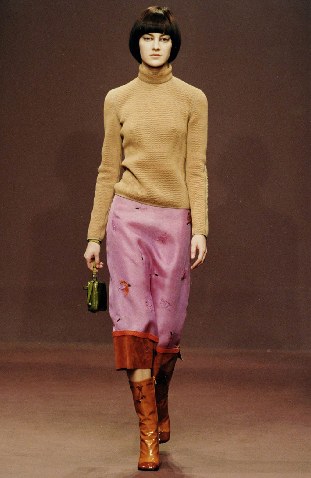
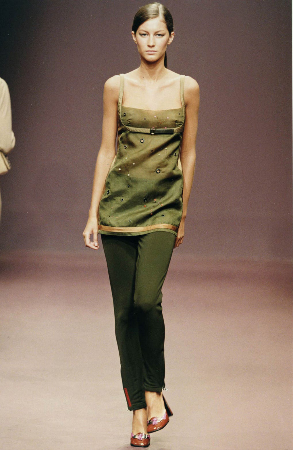
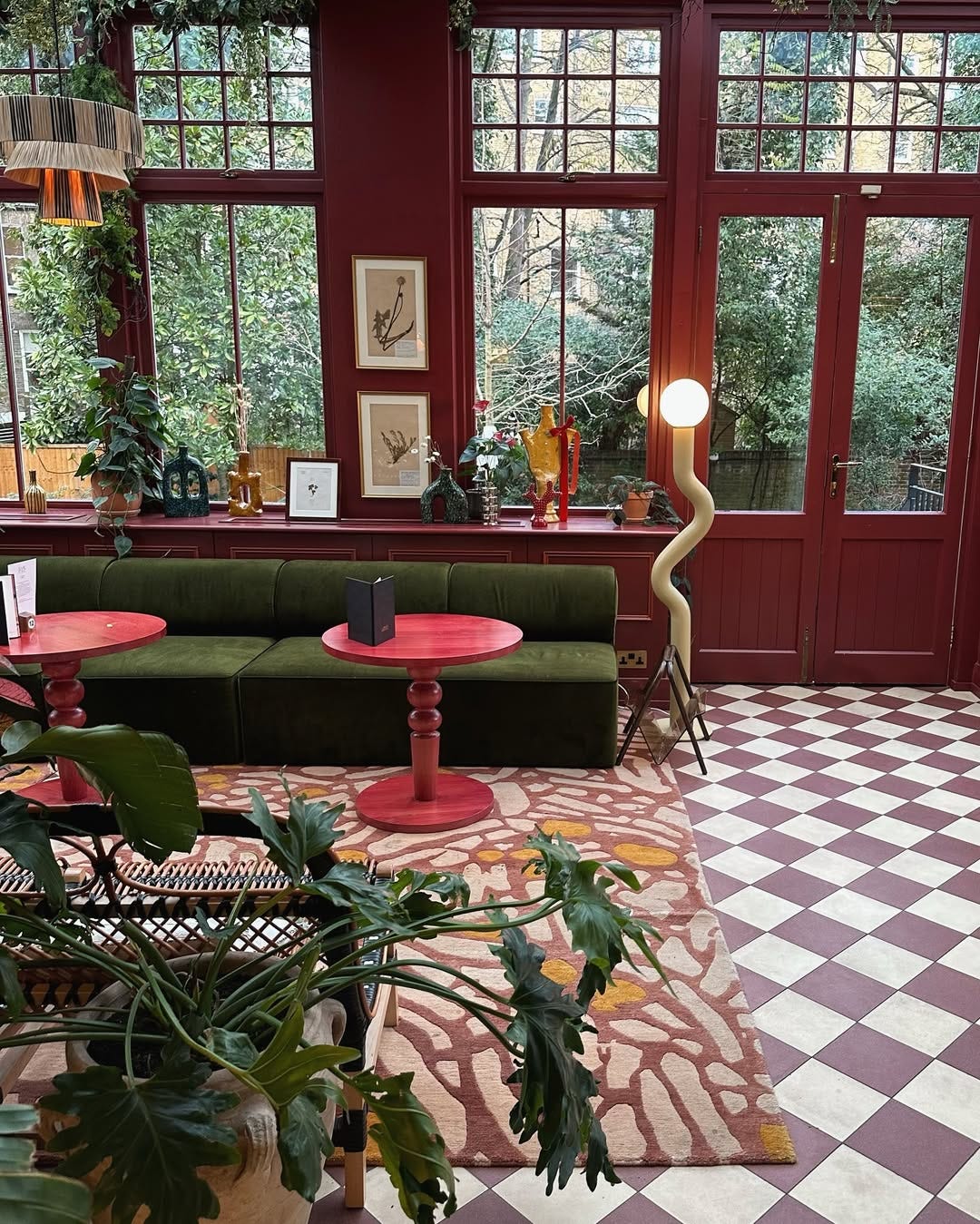
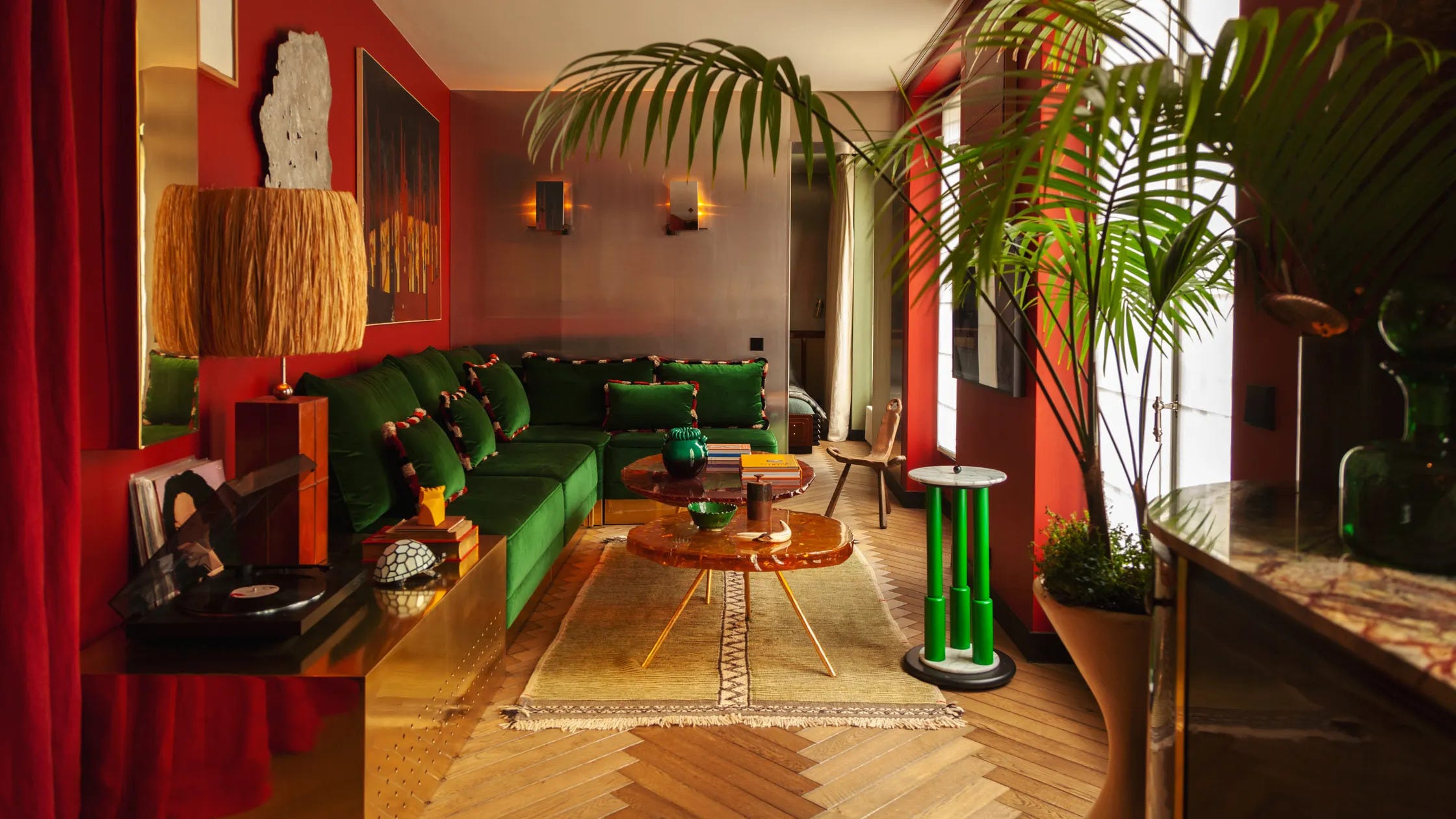
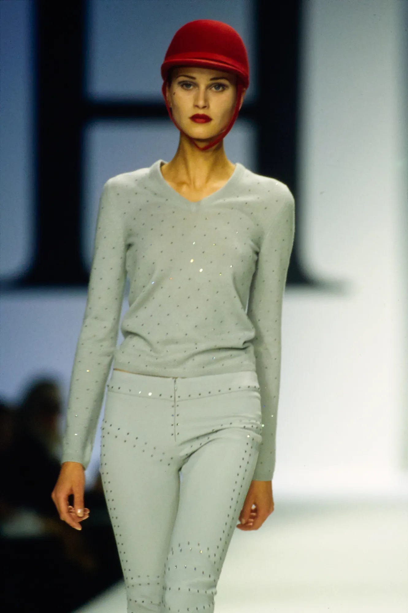
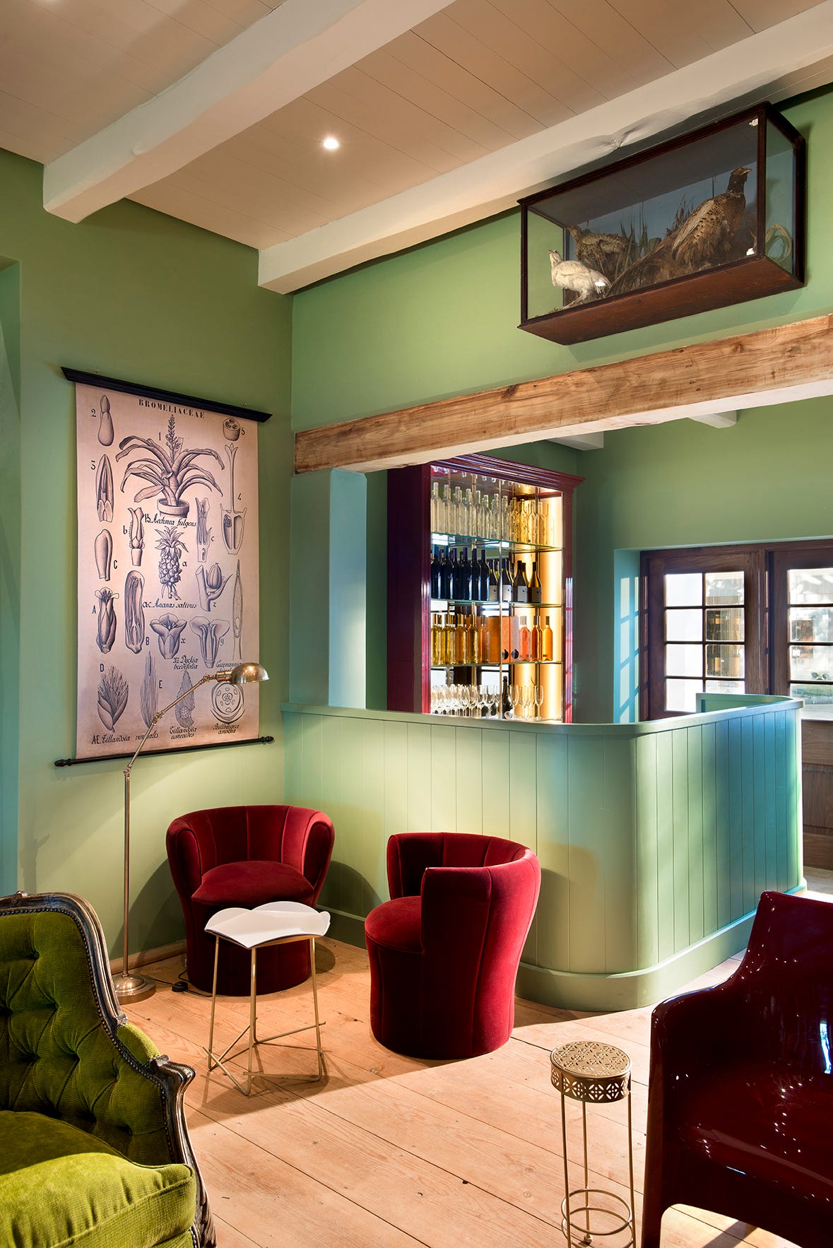
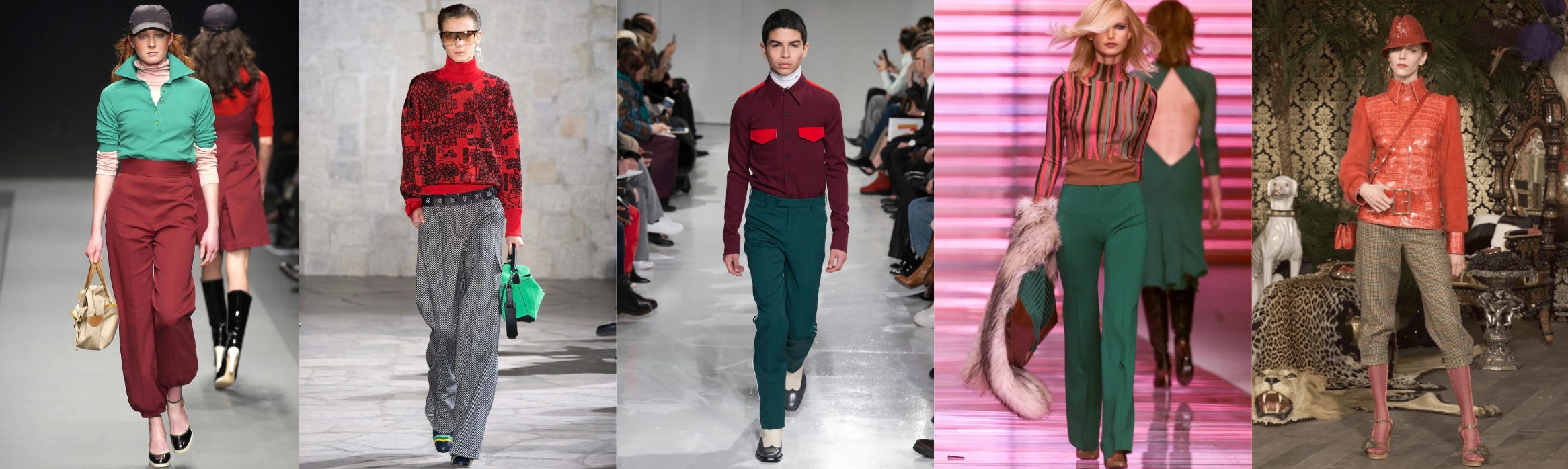
Green / Red
Red adds energy and strength, while green brings a sense of calm, stability, and balance. Together, these colors can be seen as a representation of life’s vitality, a connection between the organic world (green) and human experience or action (red).


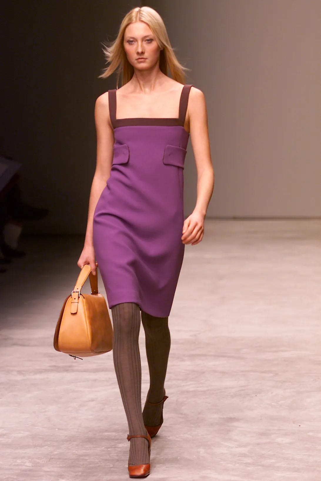
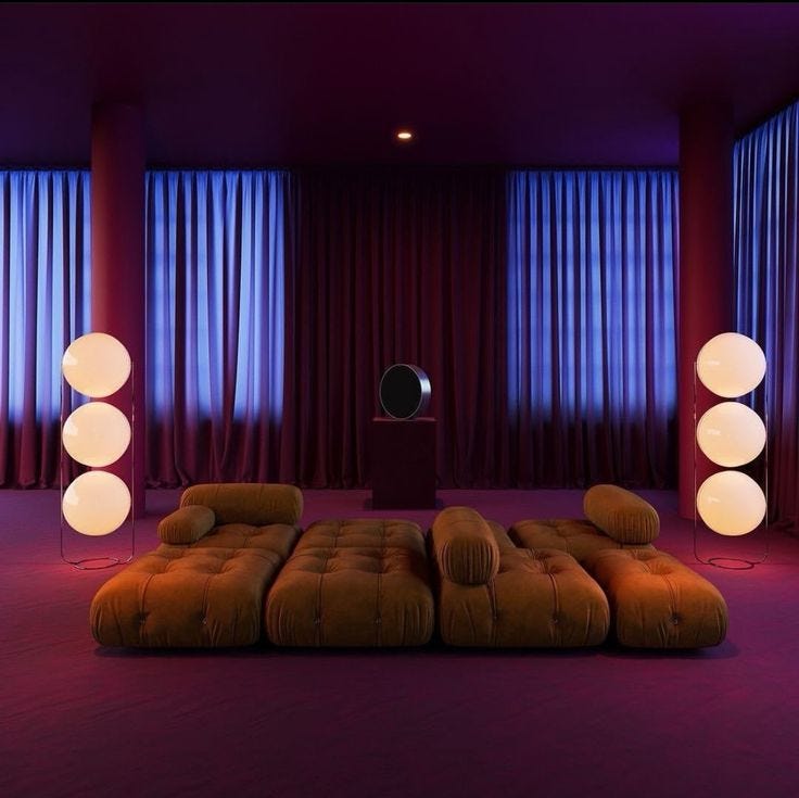
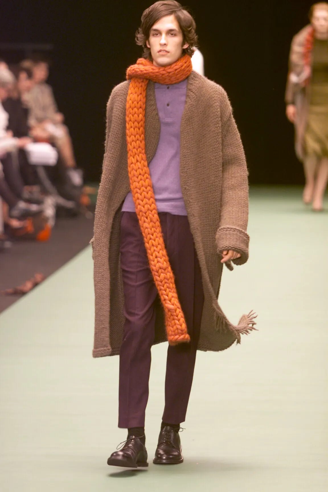
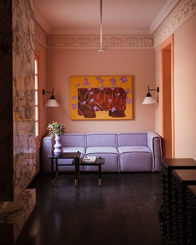
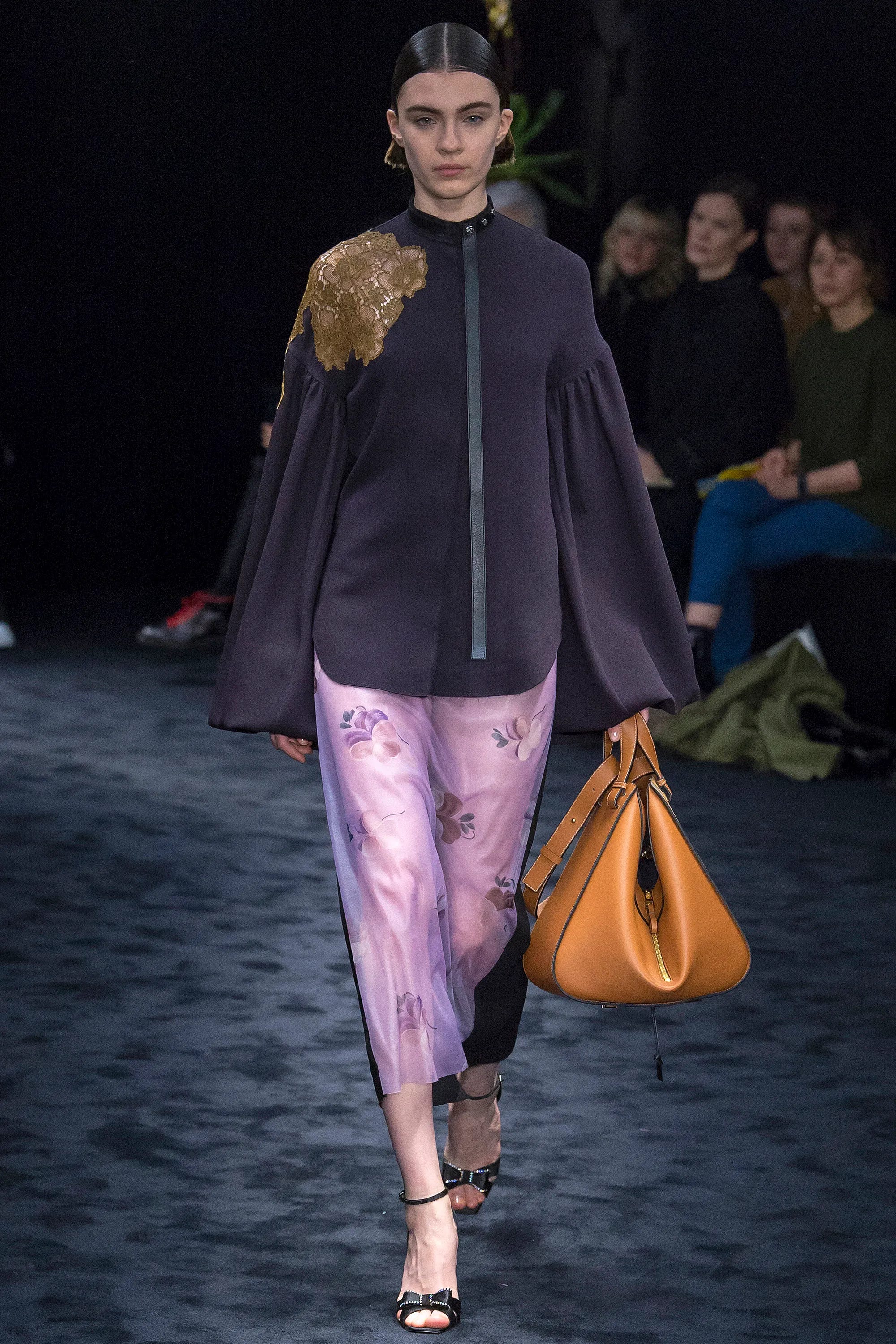
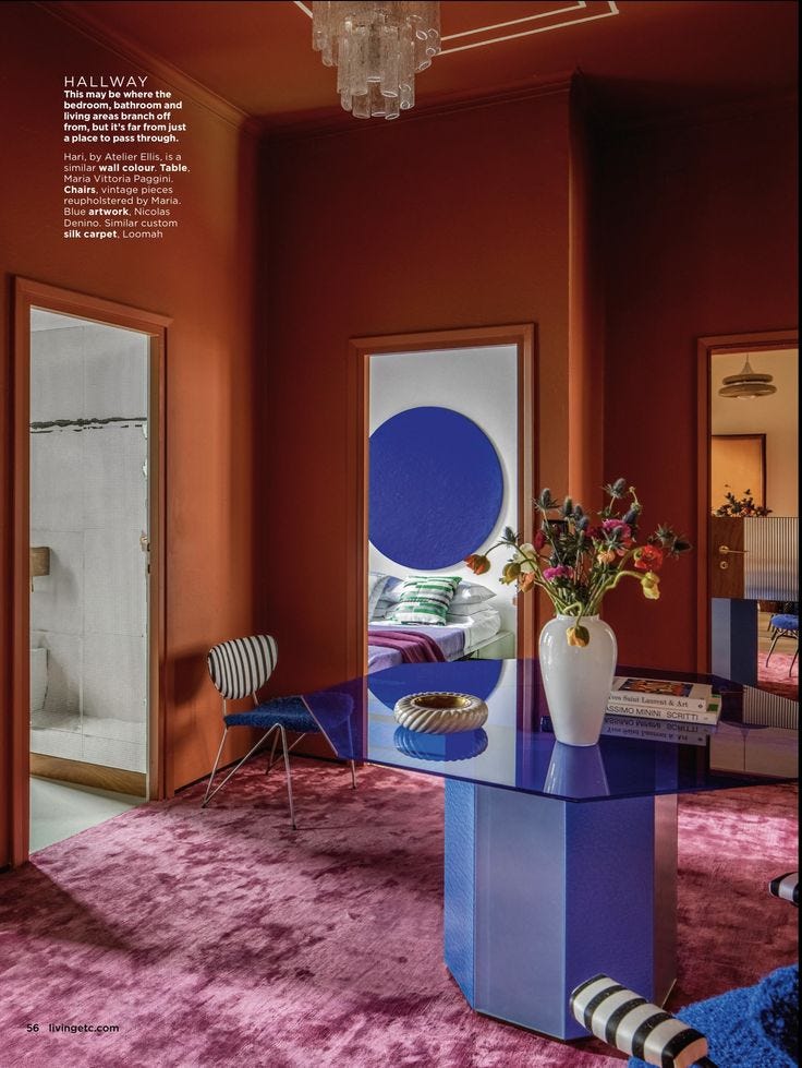
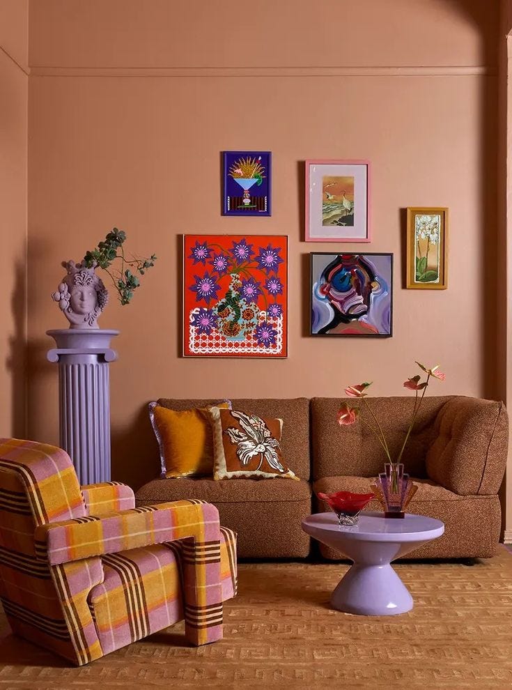
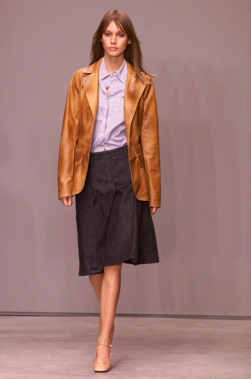
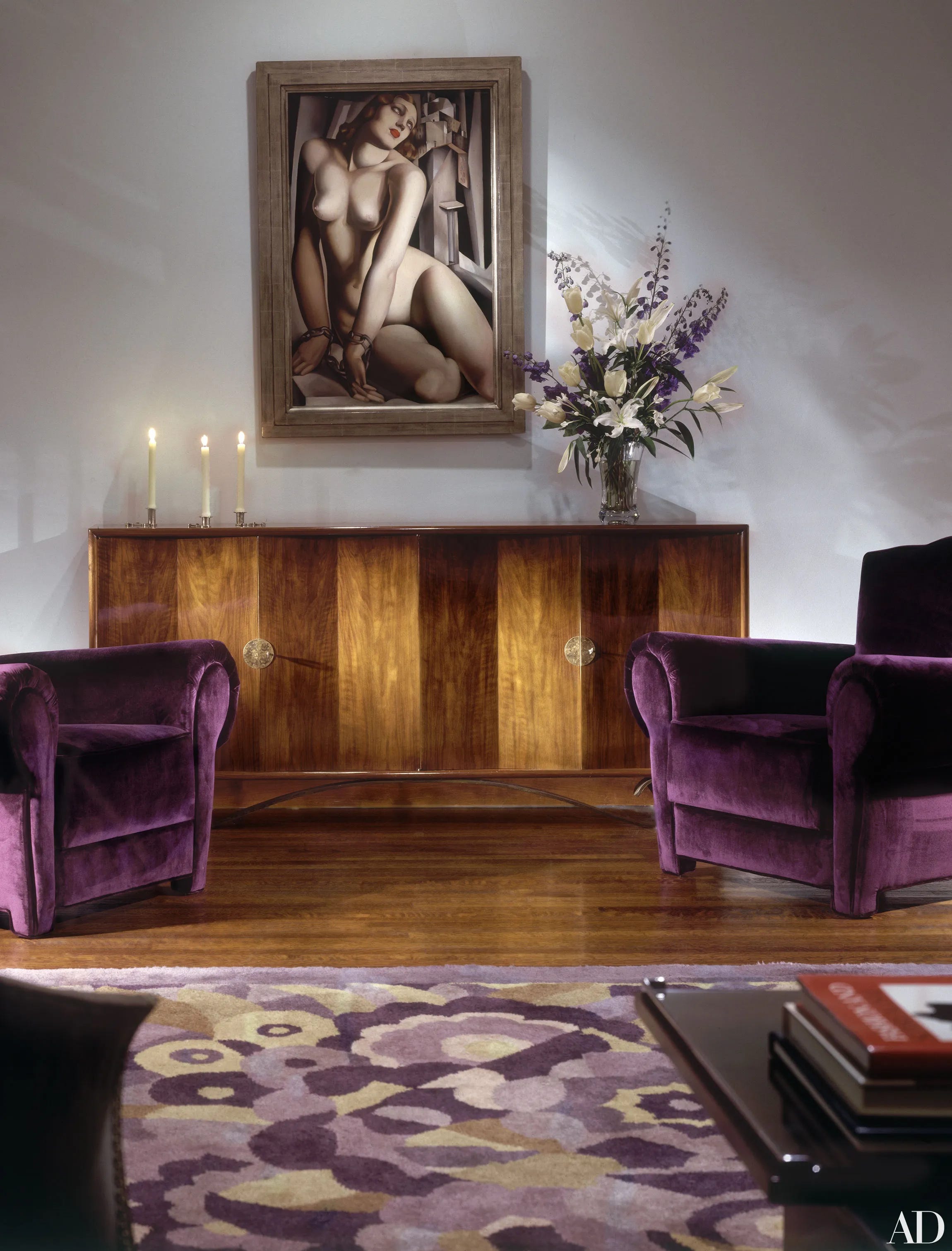
Purple / Orange
Creativity, enthusiasm, and joy meet transformation and change. Both strong, saturated colors, their pairing can represent a sense of magical wonder combined with playful energy.


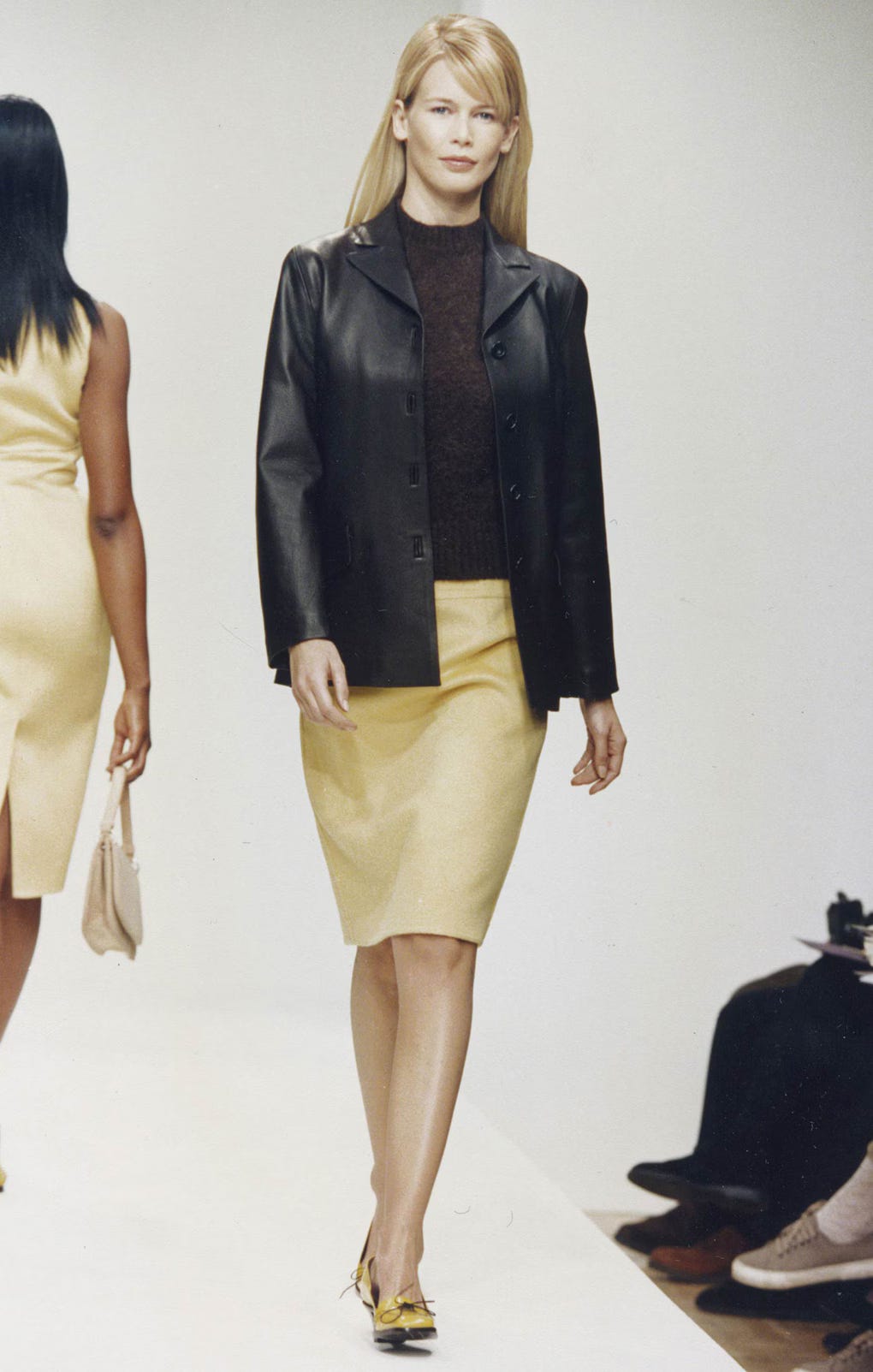
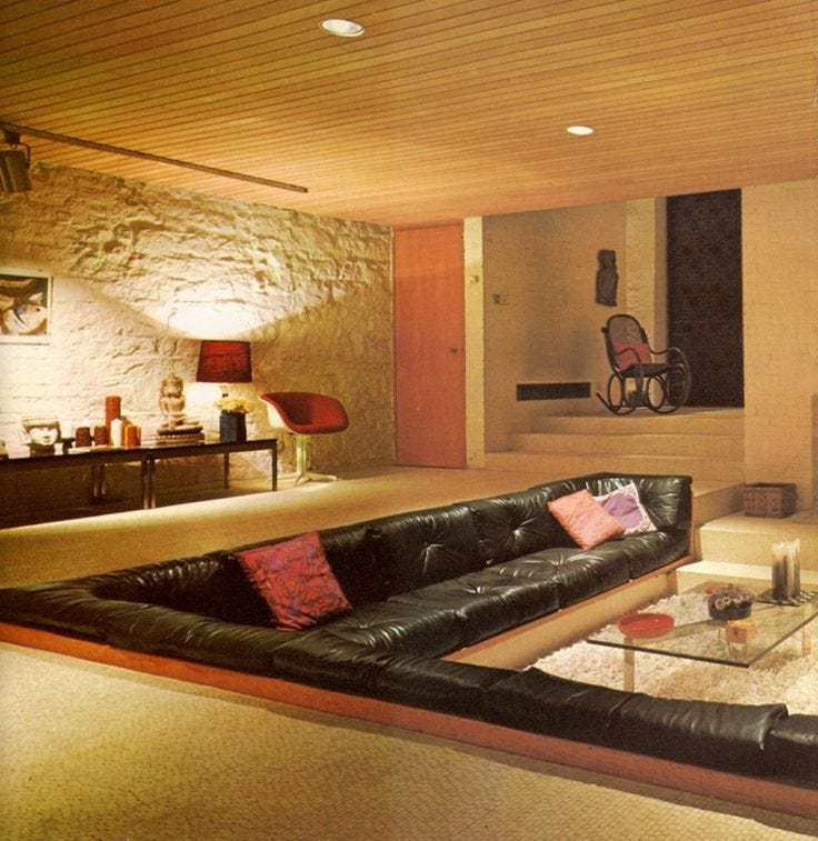
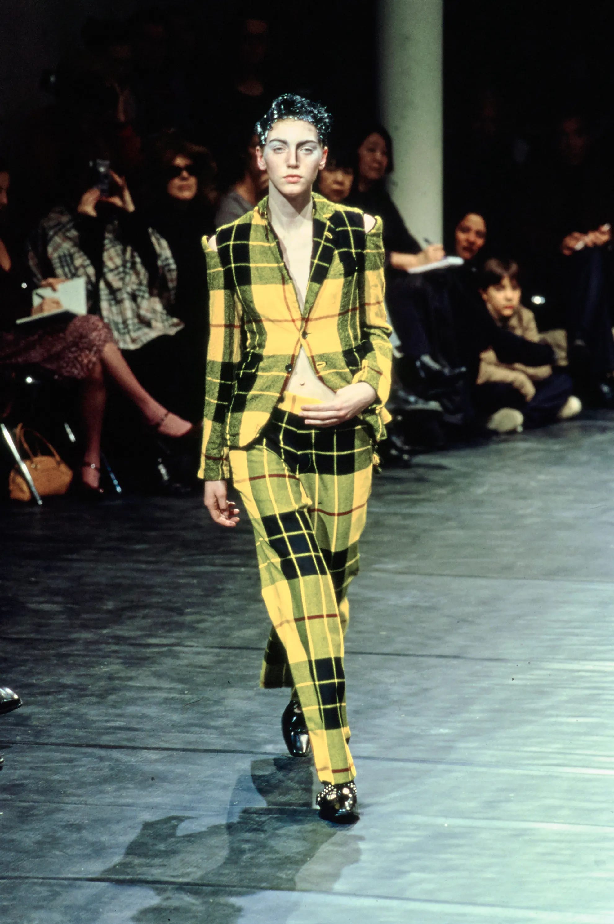
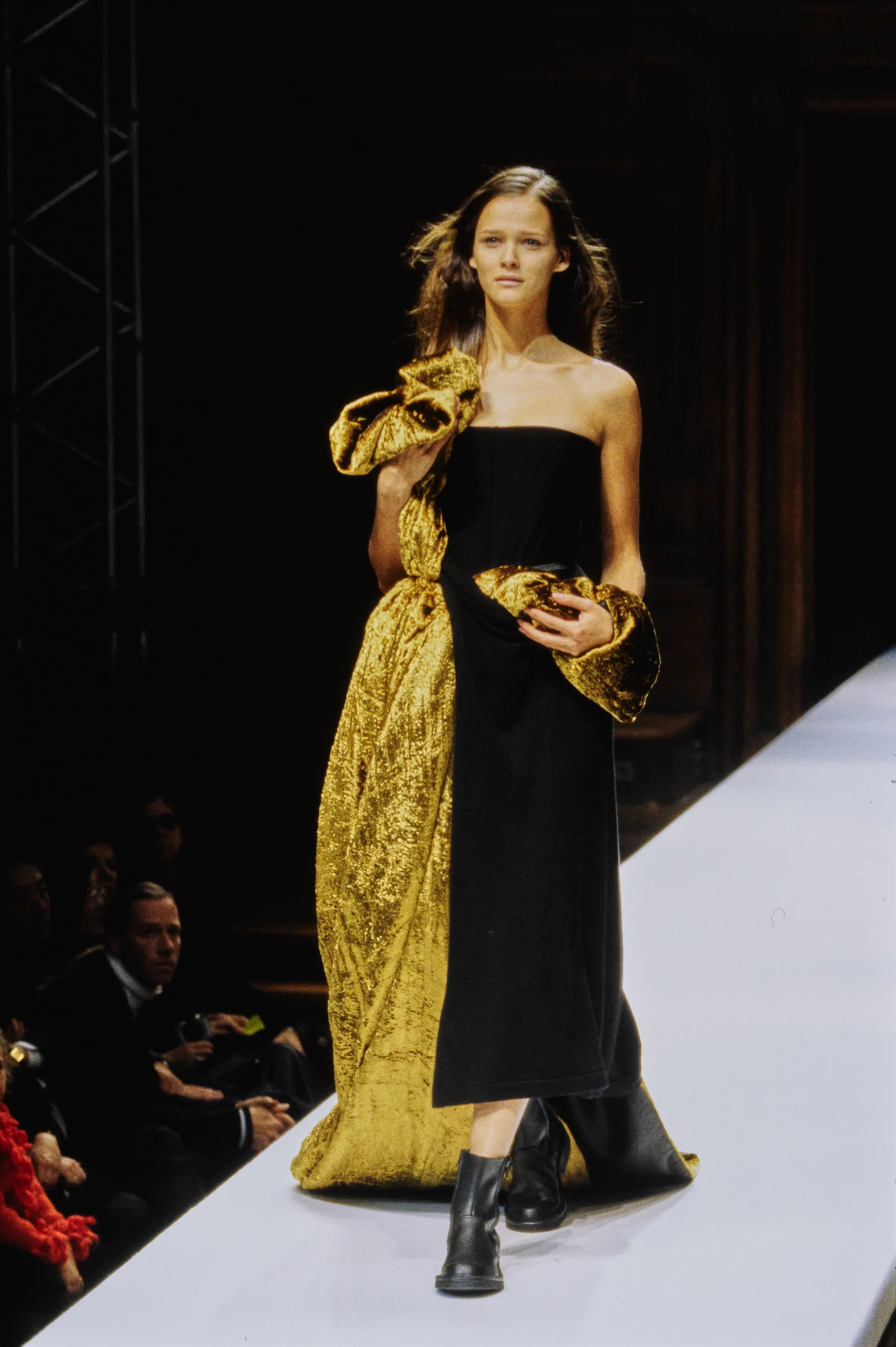
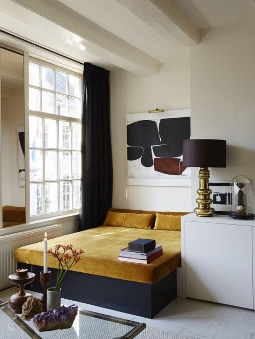
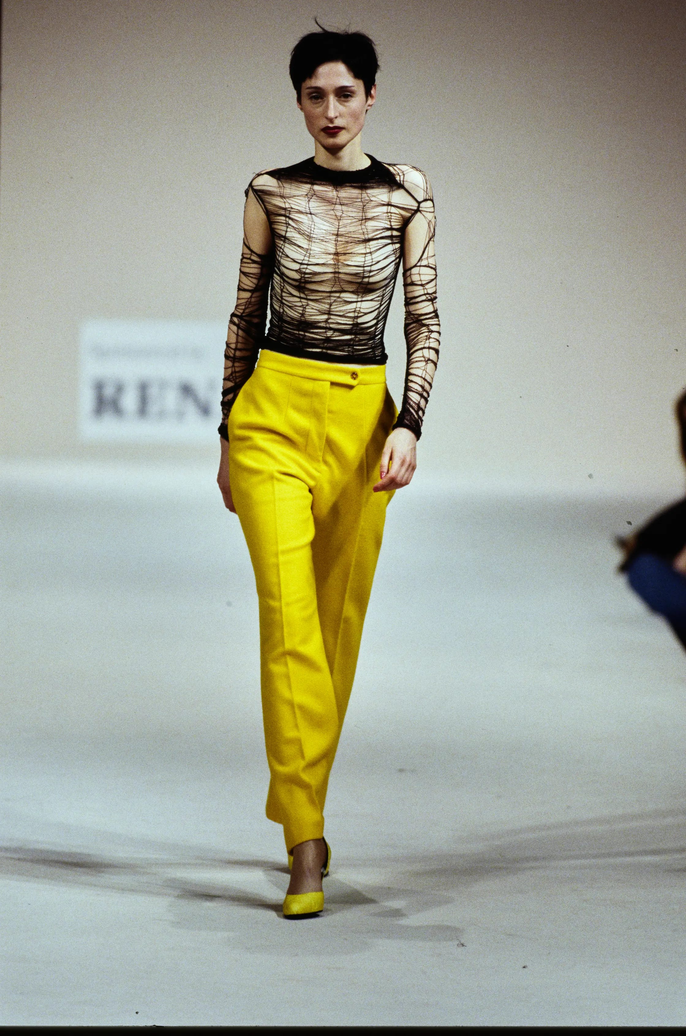
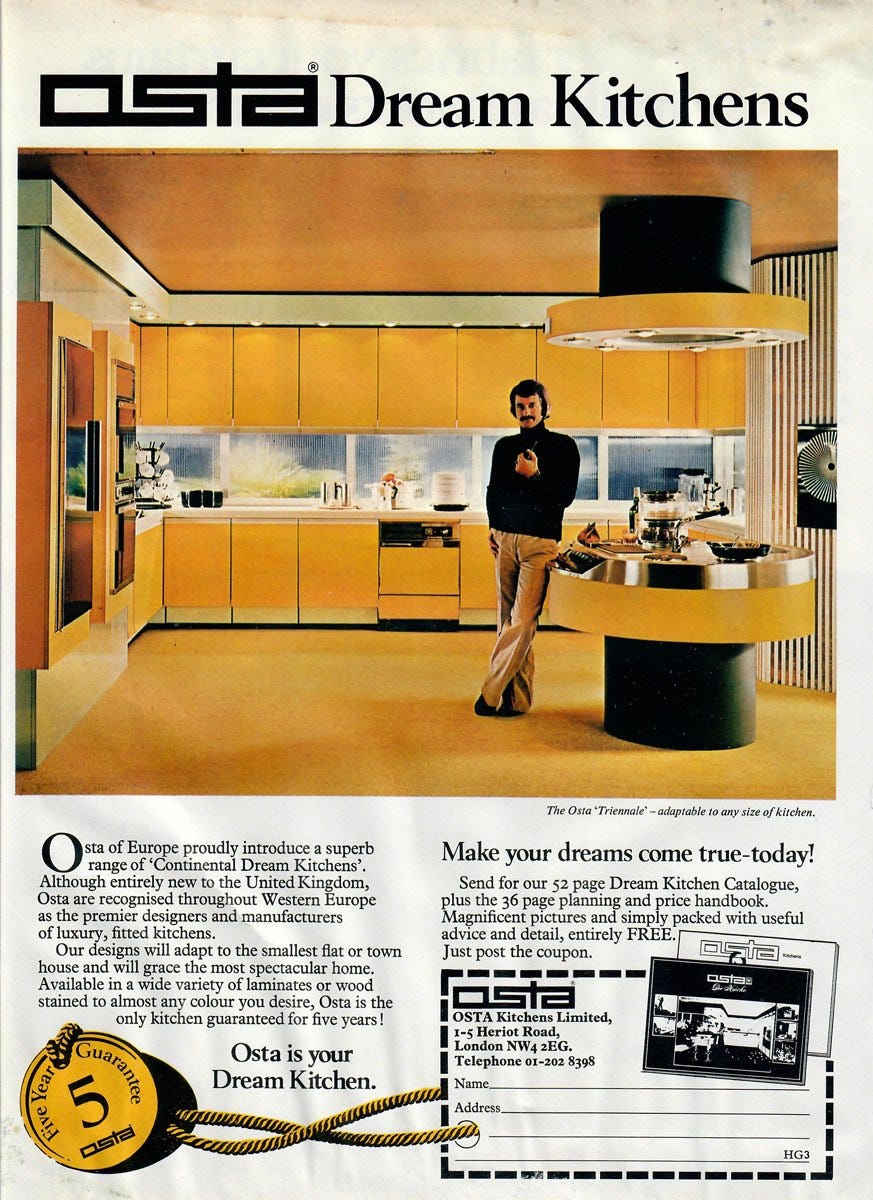
Black / Yellow
One of the most striking and high-contrast pairings in color theory. Together, yellow and black can create a bold, upscale look—combining the warmth of yellow with the refinement and sophistication of black. Caution is advised.


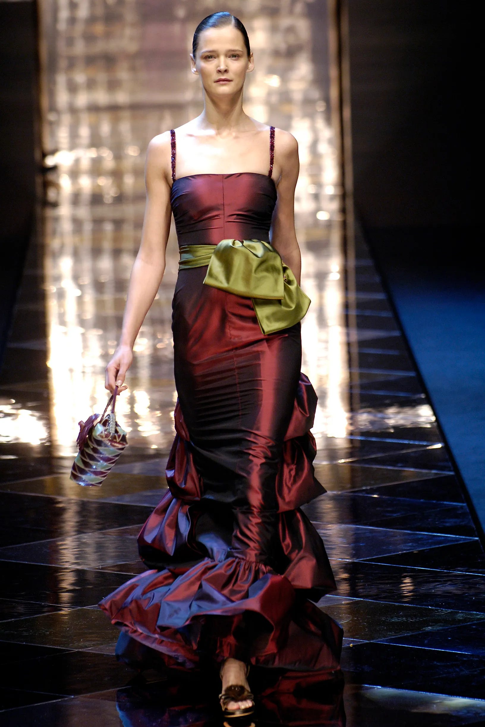
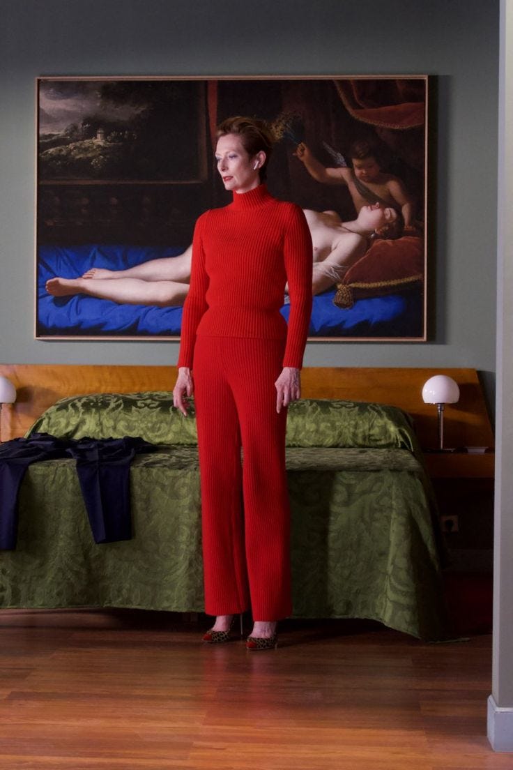
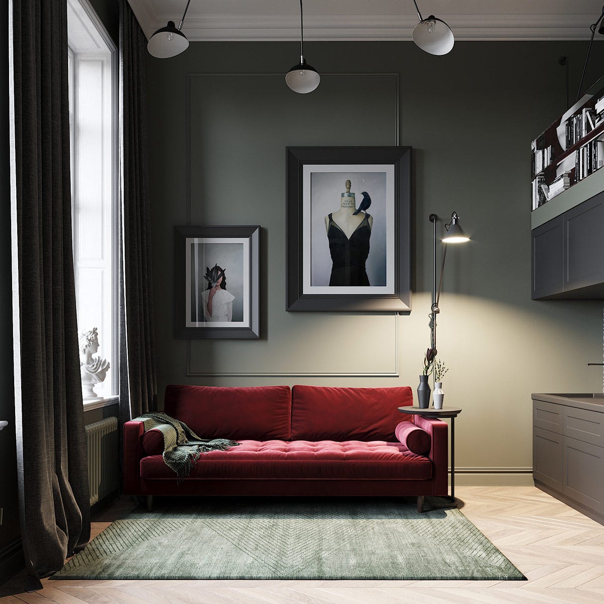
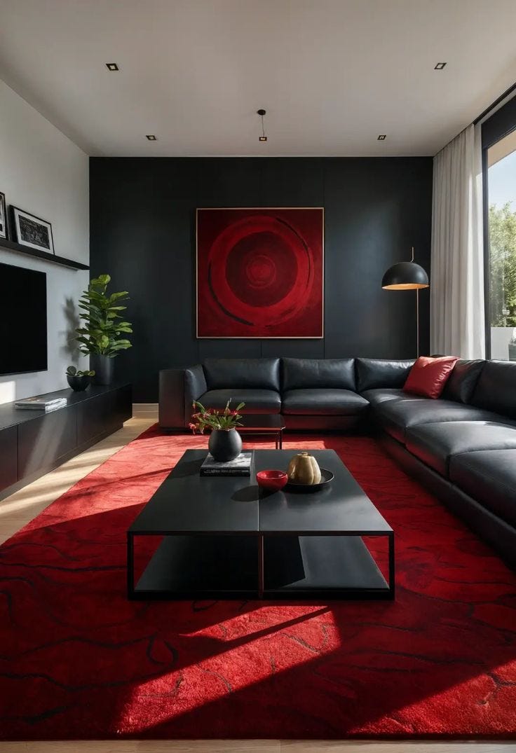
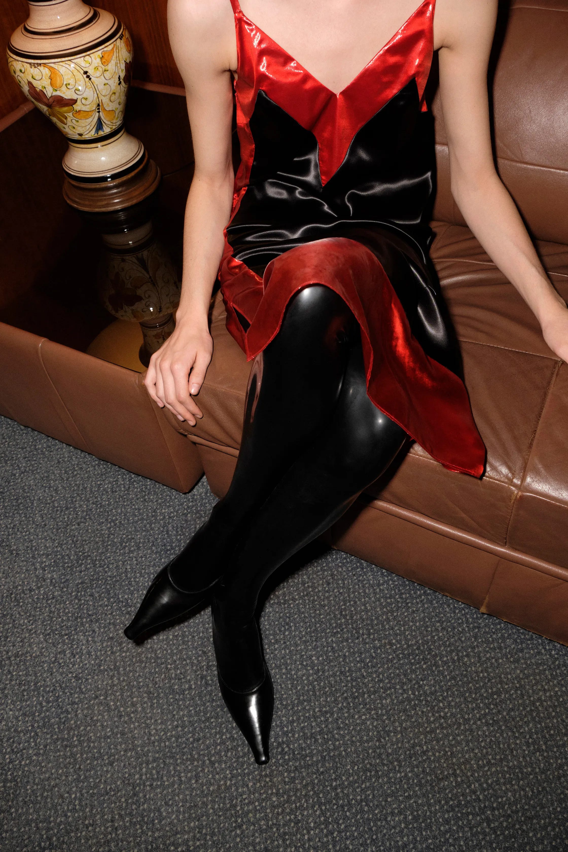
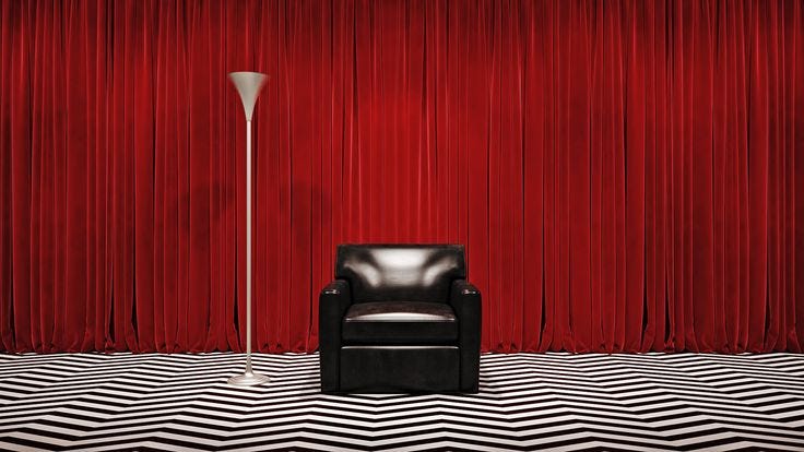
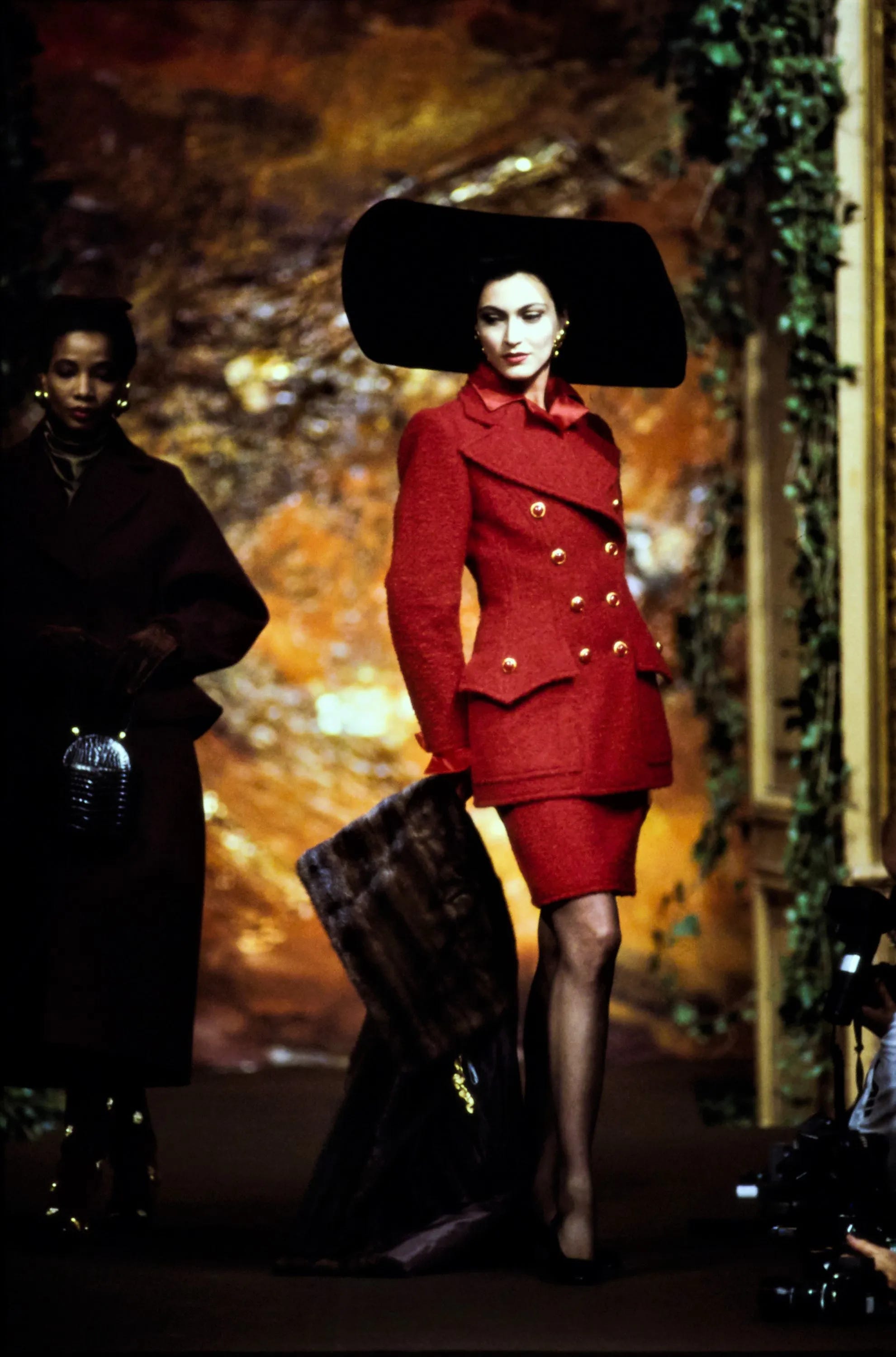
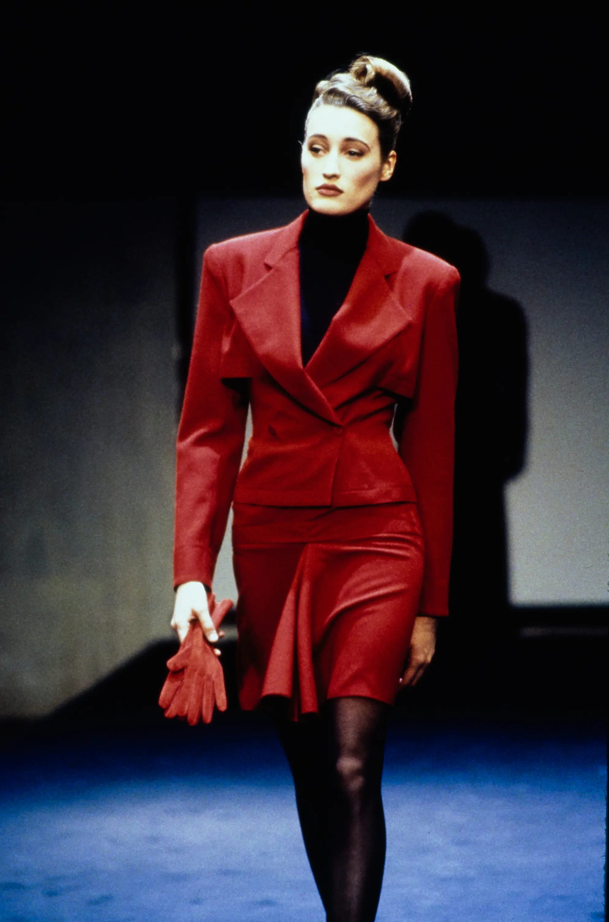
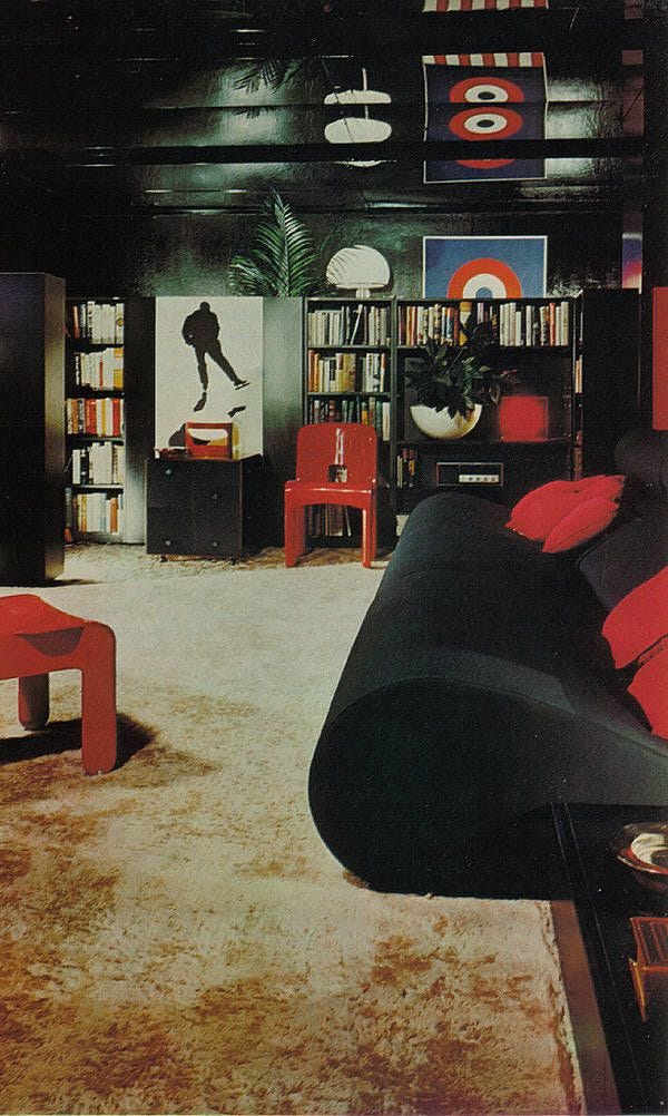
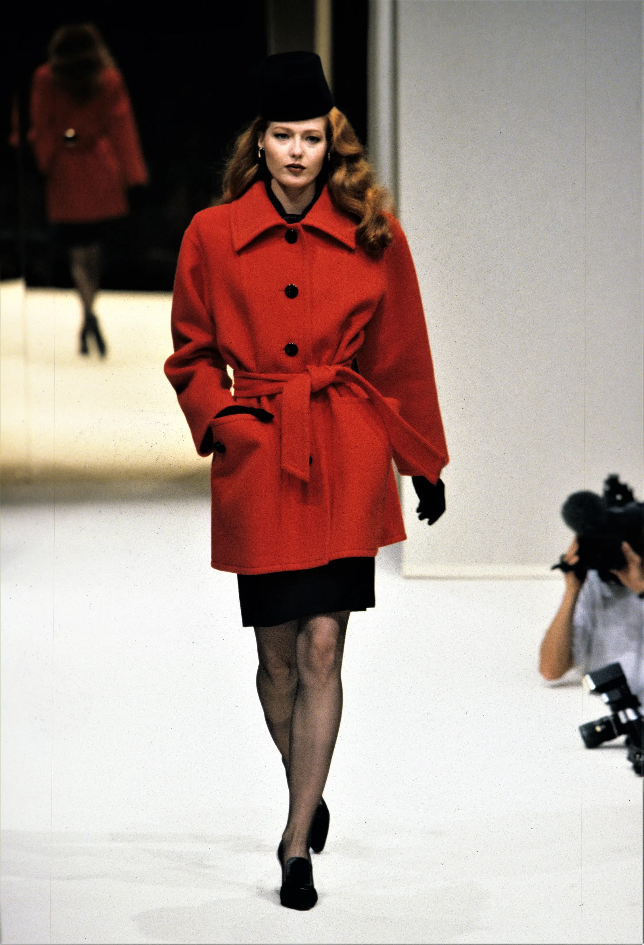
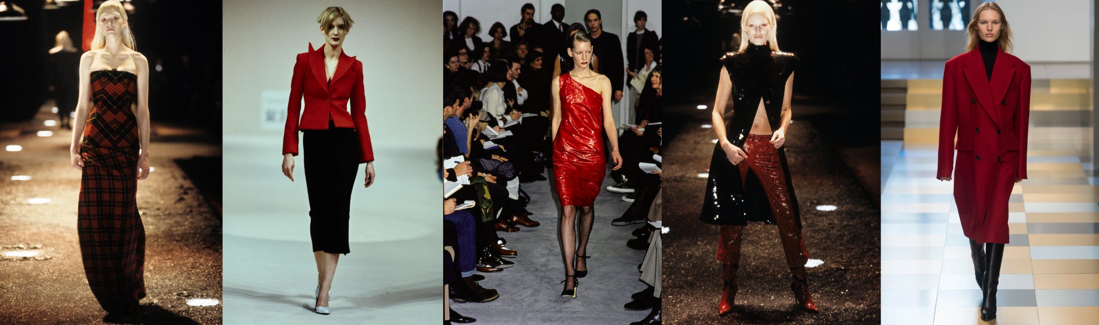
Red / Black
Power, fierce passion and seduction, with a dramatic flair.


I admire these combinations and even more the person with the confidence to wear them - every time I try I feel like I’m tOo MuCh
These color pairings are sublime. I just wrote a post about the rise of yellow, but was afraid to pair it with black. You/your images have proven me wrong - thank you!!